The Year's Best Infographics Include NBA Snowflakes, Sneaker Evolutionary Charts
(Rami Moghdam via FastCo.)

Fast Company has released a list of the best infographics of 2013 and they include a new way of visualizing NBA players' statistical impact, as well as a look at sneakers over the last century.
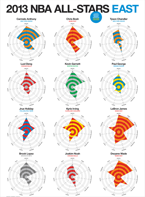
The graphic at the top shows the 2013 Eastern Conference All-Stars with 11 stats plotted over a circle to create their statistical "snowflakes," and to provide us with just another measure of how dominant LeBron James is. You can see the Western All-Stars here.
Fast Company also singled out PopChartLabs "Visual Compendium of Sneakers,"whichExtra Mustard took an in depth look at.
Game of Thrones