Call it a comeback: 90s jerseys that need to be revived
Ah, the 1990s...it was a simpler time, wasn't it? Everything seemed to better back then - the music, the movies, the haircuts and -- most importantly -- the fashion. I'm not just talking about your Starter jackets or the overalls with the strap undone, either...even sports fashion seemed to better in the '90s. It's hard to be a sports fan these days without seeing someone rocking a throwback jersey from that decade and thinking, Man, they should bring those back.
With that being said, we gave it some thought and highlighted some teams who really should bring back their '90s jerseys full-time. Our criteria were simple: what jerseys were most popular in their day, how they compare with the teams' present-day jerseys, and then whatever our Ouija board told us to pick. In part one of a two-part series, we'll be taking a look at the NBA and NHL:
Denver Nuggets
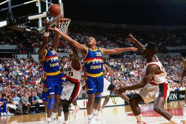
If you pitched the concept of a rainbow uniform, people would roll their eyes (except ice skating fans, I guess). But somehow, the Nuggets made these rainbow-striped uniforms work brilliantly in the mid-80s to early-90s, and they've become classics. The Nuggets' current baby blues aren't bad, but they're not in the same league as these jerseys. The teams' yellow alternate jerseys pay homage to the design, but they still aren't as cool as the originals.
Detroit Pistons

Is there any color more '90s than teal? The answer is no. Even the Pistons abandoned their red, white and blue in favor of teal during the mid-90s. Despite the uniforms being quite ugly, a lot of people -- myself included -- decided that they were awesome and wore their teal #33 Grant Hill jersey pretty much every day throughout their childhood, infuriating their parents to no end.
Oh, that was just me? Dang. Oh well, bring 'em back.
Minnesota Timberwolves
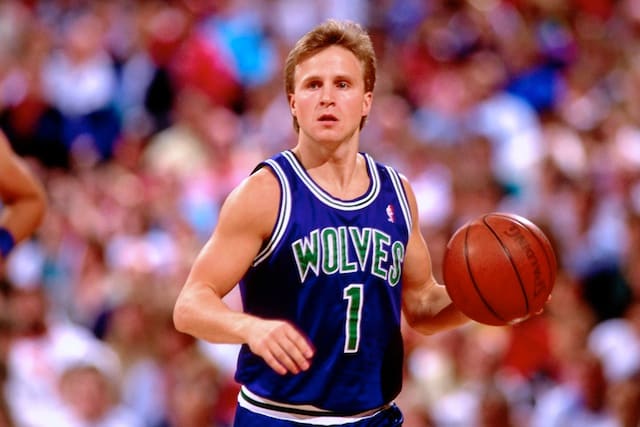
The Timberwolves have changed their look quite a bit over the years, and each new jersey seems to be busier (and uglier) than the last. The common phrase "Keep it simple, stupid" would be a solid piece of advice for the franchise, as its original blue and green jerseys from the early '90s were by far the best look they've ever had. There's nothing flashy; they're just super clean. Let's bring back a fresh look to a team that's constantly trying to do too much.
Orlando Magic

Despite efforts by the Orlando Magic to nail down a jersey in the 2000s, they have yet to match their great black-and-blue pinstriped classics. Not only are the jerseys super steezy, but also some of the franchise's best players -- Shaquille O'Neal, Penny Hardaway, Tracy McGrady -- suited up in these beauties. It wouldn't hurt to see if the team can get back to sustainable success with these unis in their lockers.

Toronto Raptors

The Raptors' purple dino jerseys finally came back into our lives this month, when the team dusted off its original look -- dead since 1999 -- to celebrate the franchise's 20th season. Their present scheme uses Canada's national colors -- red and black -- but it's nothing special compared to the vibrant look it had two decades ago.
Utah Jazz

The Jazz have toyed around with their uniforms a lot since leaving these behind in the mid-90s, but nothing has been as great as these...and it's unlikely anything ever will, considering these bad boys are some of the best jerseys basketball has ever seen. Period.
Anaheim Ducks

The Ducks have what might be the greatest logo and jerseys in the history of the NHL at their disposal, yet -– since 2006 -– they’ve continued to let them gather dust for no good reason. Instead of proudly sporting the glorious original Mighty Ducks uniforms, the team has elected to roll out a few garbage logos on top of putrid sweaters for much of the past decade.
The Ducks attempted to justify ditching the look (and the ‘Mighty’) as a way to distance themselves from the popular Disney movie(s) that led to the franchise’s inception, but their post-Mighty fashion statements have been just awful.
The Ducks have a winning lottery ticket that they’re refusing to play. Revert to the Mighty, bring back the eggplant and teal, and be rich with swag.
Arizona Coyotes

After moving from Winnipeg, the Phoenix Coyotes (now Arizona Coyotes) arrived in the desert in the mid-90s wearing these Peyote jerseys, which can only be classified as "so bad they're good." The sweaters are incredibly busy, but they paid homage to the southwest and gave the team a unique look that -- for better or for worse -- fans could feel strongly about.
The team's current look is so painfully bland and boring that these would probably be welcomed with open arms. I still can't believe they didn't switch up their uniform scheme with the name change this year -- that's like passing on a free money grab.
Boston Bruins

Boston's current scheme isn't bad at all, but it is getting kind of stale. Going with a simpler, more classic look and revisiting the team's history could be a refreshing change, especially for an Original Six franchise. Also, bring back the 'Pooh Bear' alternates!
Buffalo Sabres

In the mid-90s, the Sabres deviated from the blue and yellow color scheme that they had worn for the 20+ years of the team’s franchise history. The result? These intimidating (and totally awesome) black and red jerseys.
The team stuck with the look for a decade before scrapping and ushering in the infamous ‘Buffaslug’ era. The Sabres have stuck with the blue and yellow ever since, but the team has yet to design a jersey as unique and as awesome as the mid-90s-early 2000s look. Their current uni scheme is quite drab (excluding those ridiculous third jerseys, of course) and we already know that Connor McDavid looks great in red and black. Just sayin'.
Los Angeles Kings

I don't mind the Kings' current jerseys or logo -- and it's hard to argue with the amount of success they've seen while wearing them -- but they're nothing special, either. The Gretzky-era Kings in the '90s had better jerseys and a MUCH better logo to work with; the scheme incorporated more silver into the motif, which went a long way towards providing a royally badass look. (Side note: We're just going to pretend the Burger King alternates never happened.)
If you're the Kings, though, you might not want to fix what ain't broken.
Winnipeg Jets

All right, technically it's not the same Winnipeg Jets that wore these awesome duds back in the '90s, but that doesn't mean they can't bring them back. There's nothing too flashy about the ol' Jets sweaters, but it's a classic look with a great logo that would provide an upgrade over what the modern day Jets are currently sporting.
Pete Blackburn is a writer for Next Impulse Sports