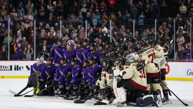
Third jerseys are back in black

Years ago, in a simpler time, teams had two looks: one at home and a second for the road. But over the last decade, clubs have been adding flair to the wardrobe with some regularity.
The NHL introduced its third jersey program in 1995, when five teams brought fresh looks to the their closets. Since then,hockey fans have seen the good, the bad and plenty of the ugly. And after a year without them -- the league-wide uniform switch to Reebok last season meant no thirds for 2007-08 -- they're back.
In black.
Seven of the 19 clubs sporting thirds this season have chosen to go with a predominantly black jersey. I know hockey players like their AC/DC, but come on. That's more black than a Fashion Week runway. It's said that a dark jersey intimidates opponents (foes of the the NFL's Oakland Raiders may beg), but with so many black jerseys in the NHL, the collection of this season's thirds is somehwat bland.
It's to be understood. Big risks haven't always paid off. Recall the Islanders' fish sticks fiasco in 1995, when their crest was replaced by the twin brother of the Gorton's of Gloucester fisherman? The ridicule (Rangers' fans added, "We want fishsticks!" to their anti-Islanders repertoire) and outrage from their own fans made that update a short-lived bad memory.
Then there was the Mighty Ducks' inaugural third. As if their logo wasn't hokey enough (they were a living, breathing Disney movie poster), their first alternate jersey featured a hockey-playing cartoon duck, arms up, leaping into the air. It was a look that made you laugh, before feeling really sorry for the guys who had to wear them. But hey, I hear they've become a rather pricey collector's item.
In the years since, the NHL's third jerseys have become better thought-out endeavors. Many teams, like the St. Louis Blues this year, will hire an outside marketing company to help create designs that further extend the brand. From color choice to placement of logos and crests, every minute detail and decision is belabored and then tested -- with fans, on camera, and of course, with the players.
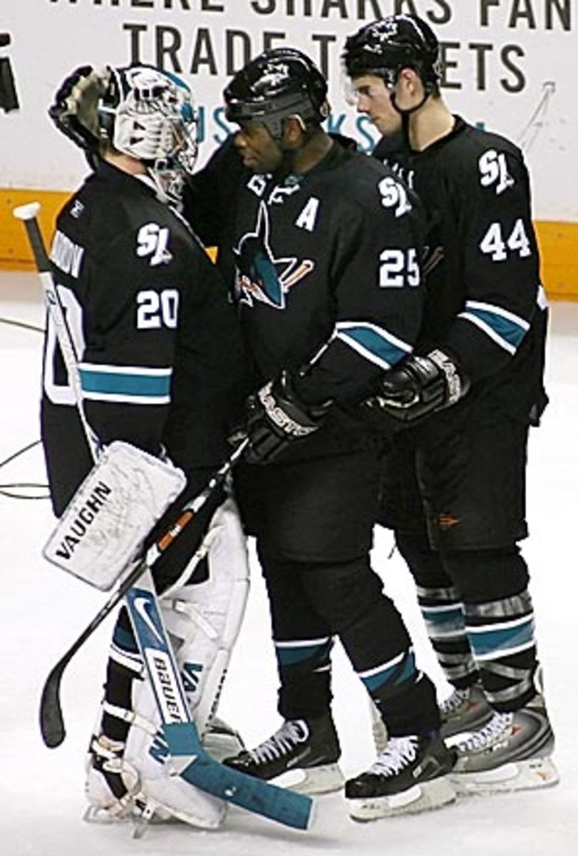
The Sharks, whose BlackArmor uniform has a corporate sponsor, thought about changing the front dramatically by using one of their secondary logos before settling on an updated shark.
"Yeah, there are many factors we have to consider," says Malcolm Bordelon, San Jose's EVP of Business Operations. One of the issues with using the crest, he says, was that players were concerned that the shield logo, if placed across the chest, might be too easy to grab in a tussle. Many factors, indeed.
And this year's thirds seem to fall into two general camps: those looking to the past and those looking forward. Throwback thirds are nothing new -- in hockey or other sports. The Edmonton Oilers, whose blue and orange uniforms from their 1980s championship era were revived, and the Flyers, who are sporting Broad Street Bullies' bright orange in a handful of games this season, are just two examples of teams paying homage to their heydays with historical thirds.
Others, like Ottawa and Phoenix, made a conscious effort to move their looks forward. "We don't have the kind of history other teams do," says Doug Moss, president of the Coyotes. "Our history would be that Picasso Coyote. We want to create a history here."
This year's thirds have generally been well received by players and fans -- the NHL has already sold out of its first run and is on its second production -- and while there doesn't seem to be any major duds on par with fishsticks, the jumping Duck or the Lightning's storm scene, we can't say they're all smash hits, either.
Given that all 19 of the thirds have been introduced now, we assembled a small panel of staffers here to rate and rank this year's batch, which you can view in this photo gallery.