The Meaning Behind Crests: Man United's Red Devil, Panathinaikos's Shamrock and More
With sports, including soccer, at a standstill, it's a good time to delve into the history and culture of the game. Nowhere are those more evident than on club crests. They often just include a crown and a ball. But on occasion, logos feature an element inspired by a fascinating story or some esoteric or hidden meaning.
We brought you two such lists back in 2017 (Part 1 | Part 2). Here's a third:
ASTON VILLA

It’s yet another lion, but Villa’s lion isn’t just any lion. The classic English lion, found in the national team crest, is “passant,” or walking. Villa’s is “rampant,” or standing. That’s thanks to William McGregor, a Scottish immigrant and draper in Birmingham who became club president in 1880 and eventually helped create the Football League. Villa already had ties to Scotland via a couple of noteworthy players, and McGregor sealed the connection by making the lion rampant—the one found on the Royal Banner of Scotland—the symbol of the iconic Midlands club. The white star represents Villa’s 1982 European Cup triumph.
BOTAFOGO

Founded in 1904, Botafogo took its name from the Rio de Janeiro neighborhood that also was the site of a rowing club, the older Club de Regatas Botafogo. In 1942, the two organizations merged and became Botafogo de Futebol e Regatas. The soccer team’s badge, a monogram featuring the club’s BFC initials, was replaced by the lone white star that was the symbol of the rowing club. That star actually was the Estrela D’Alva—Venus—which the early-to-rise rowers saw each morning dominating the sky over the bay.
CARDIFF CITY

The Welsh team first used a bluebird on its crest in 1959, but the nickname goes back much further. In 1911, the play The Blue Bird enjoyed a successful six-night run in the Welsh capital. Soon after, Belgian playwright Maurice Maeterlinck won the Nobel Prize. Cardiff City had adopted blue uniforms three years earlier and a fan or fans, inspired by the play and the bluebird of happiness therein, coined the nickname. Allegiance to the name and color was enough to overcome owner Vincent Tan’s 2012-15 effort to change the jerseys to red and to feature a dragon at the center of the club crest.
CRUZ AZUL

The six-time Concacaf champion was founded as an amateur team in 1927 by workers from the Cemento Cruz Azul cement company, which has been around since the 19th century. The Mexico City club still takes both its name and badge from the company, which is rare. Visit Cemento Cruz Azul’s website today and you’ll see the logo featuring a blue cross inside a red square. The biggest difference is the eight stars, which represent the soccer club’s eight Liga MX titles.
DUNDEE UNITED
Ian Harkes and Dillon Powers aren’t the only American influences at Dundee United. The most interesting thing about the Scottish club’s logo isn’t the lion. Those are a dime a dozen. It’s the ‘tangerine’ color that inspired one of the team’s nicknames. United wore white and black until the late 1960s, when it took part in an interesting experiment designed to grow soccer in the USA—the United Soccer Association. There, United spent the summer of ’67 playing as the Dallas Tornado. Owned by Lamar Hunt, the Tornado wore orange. The United manager’s wife supposedly liked the look, and it stuck. It’s now a centerpiece of the club’s identity.
SC HEERENVEEN
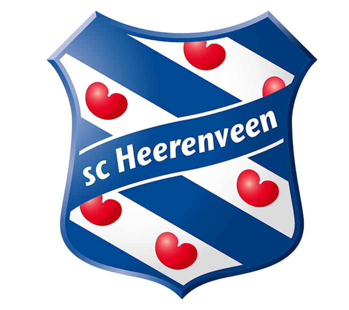
Those aren’t hearts on the badge of Michael Bradley’s first European club. They’re ‘pompeblêden,’ or water lilies, which were a popular element in the medieval heraldry of Northern Europe. The flag of Friesland, the Dutch province where Heerenveen is located, features pompeblêden that represent the formerly independent Frisian communities that united to resist the Vikings. Heerenveen’s crest and jersey are similar to the flag, and the pompeblêden are an appropriate symbol for flat lands on the sea.
INTER MIAMI
The element that sticks out most on Inter Miami’s badge is the pink, which stands for the color the new club’s jerseys should be. But there are also a couple more subtle symbols. The herons’ intertwined legs, which are supposed to symbolize unity, also form an ‘M.’ And the eclipse between them—a promise that Inter will work “day and night”—features seven rays. They represent the number that club co-founder David Beckham wore for England and Manchester United.
IPSWICH TOWN
The 1981 UEFA Cup winners used the town arms featuring a lion and ships until the early 1970s, when the club rebranded and went with a badge suggested by the treasurer of the supporters club. His design centered on the Suffolk Punch horse, a strong, sturdy breed of draught horse developed in the 16th century and apparently preferred by Henry VIII. The horse became of symbol of Suffolk, in which Ipswich is by far the most populous town.
MANCHESTER UNITED
The shield in United’s crest used to feature the Manchester city arms—a sailing ship on top and three diagonal stripes below. During the 1960s, as the club moved forward from the Munich disaster and the Busby Babes era, manager Matt Busby thought a new nickname was appropriate. He reportedly was inspired by the nearby Salford rugby club, which had been dubbed “Les Diables Rouges” during a 1934 tour of France. United adopted the Red Devils nickname, and in 1970, the devil became part of the badge.
NAC BREDA

The three initials on NAC’s classic black-and-yellow crest do some absurdly heavy lifting. U.S. Soccer sporting director Earnie Stewart’s former team was formed in 1912 by the merger of a club called NOAD and a club called ADVENDO. Both names were acronyms of team mottos. NOAD stood for “Nooit Opgeven Altijd Doorzetten,” or “Never give up, always persevere.” And ADVENDO stood for “Aangenaam Door Vermaak En Nuttig Door Ontspanning,” or something like “Pleasant for its entertainment and helpful for its relaxation.” So the combined club became, ahem, Nooit opgeven altijd doorzetten, Aangenaam door vermaak en nuttig door ontspanning, Combinatie Breda—or NAC Breda for really short.
NEWCASTLE JETS

You don’t often see something so modern featured on a soccer club’s crest. Australia’s Newcastle Jets, founded as Newcastle United Jets in 2000, avoid the use of civic symbols and heraldry, old buildings or natural elements and instead go for three F/A-18 Hornets. Newcastle’s McDonald Jones Stadium is located around 15 miles south of RAAF Base Williamtown, which is the headquarters of the RAAF’s Air Combat Group and home to three units that operate the Hornets.
NEWELL’S OLD BOYS
Lionel Messi’s boyhood club was founded in Rosario in 1903 by Isaac Newell, an English educator who also had founded a school, the Colegio Comercial Anglicano Argentino, about 20 years earlier. Physical education was an important part of the curriculum there, and graduates formed the core of the eventual soccer club. When it was time to design a team crest, the Old Boys looked to the Colegio, which used a shield divided in two—one half in red for the flag of Newell’s England, the other in black to represent the home of his German wife, Anna Jockinsen. NOB has won six Argentine championships.
PALMEIRAS
We’ve seen stars stand for titles, states, and players. At Palmeiras, they also stand for months. When the São Paulo club redesigned its logo in 1959, it hid its founding date inside the crest. The eight stars stand for the eighth month, August. And the 26 horizontal stripes inside the shield represent the 26th. The club launched on Aug. 26, 1914 as Palestra Italia, changed its name to Palmeiras in 1942, and since then has won a record 10 Brazilian championships and one Copa Libertadores.
PANATHINAIKOS
Why does the largest club in the city of Athens wear a traditional Irish symbol? Because of a Canadian, so the story goes. His name was William Sherring, and in 1906, he won the marathon at the “intercalated” Olympic Games in Athens. Sherring raced for Hamilton’s St. Patrick’s Athletic Club and ran with a huge shamrock on his shirt. It was high-profile stuff. Greece’s crown prince even joined Sherring on his final lap inside the Panathenaic Stadium. Panathinaikos was formed two years later and shortly thereafter, while looking for a symbol that might unite a diverse city, it chose the shamrock that Sherring made famous.
CA PARANAENSE

The Brazilian club unveiled this radical redesign toward the end of 2018 and promptly went out and won the Copa Sudamericana. The four stripes represent the four winds of a hurricane and together form an ‘F’, for ‘Furacão.' The Furacão/Hurricane nickname came from a 1949 newspaper headline describing a Paranaense performance.
PORTO
Atop the Portuguese power’s complex crest sits the dragon, which has become such an important symbol of the club that its stadium opened in 2003 is called Estádio do Dragão. The green wyvern was associated with the royal House of Braganza. It was through one of its kings, Pedro IV, that the dragon became linked to Porto, which withstood a year-long siege during a civil war in the early 1830s. Dom Pedro successfully defended the city against his brother, but died of tuberculosis shortly thereafter. But before that, in recognition of Porto’s efforts, he bestowed the motto “Invicta,” or “undefeated” on the city, which adopted the Braganza dragon in return.
SAN DIEGO LOYAL

The new USL Championship club’s brand represents an homage and commitment to San Diego, which lost its NFL team in 2017 and its NBA team in 1984. The sun is comprised of the initials ‘SD,’ and the ‘y’ in ‘loyal’ is supposed to be shaped like the California poppy, the state flower. But there’s more to the ‘y.’ It also depicts the shank of an anchor, the arms of which are formed by the curved bottom of the shield. The Loyal aren’t going anywhere.
SANFRECCE HIROSHIMA
Like many Japanese clubs, Sanfrecce Hiroshima’s name uses a portmanteau that includes a word from a European language. In this case it’s ‘frecce,’ which is Italian for ‘arrows.’ ‘San’ is Japanese for ‘three.’ The name was inspired by the story of Mōri Motonari, a 16th-century feudal lord in the Chūgoku region where Hiroshima is located. Motonari is famously associated with a parable in which he demonstrated to three sons how one arrow was easy to snap, but three arrows together were practically unbreakable.
VANCOUVER WHITECAPS
One of MLS’s most distinctive logos is a clever combination of the club’s initials and the inspiration for its name, the white-capped mountains of the North Shore and white-capped waters of Vancouver Harbour. The mountains up top are reflected in the water below, where they also form a ‘V’ superimposed on a ‘W.’ The light blue color represents the 1979 Whitecaps team that won the NASL championship.