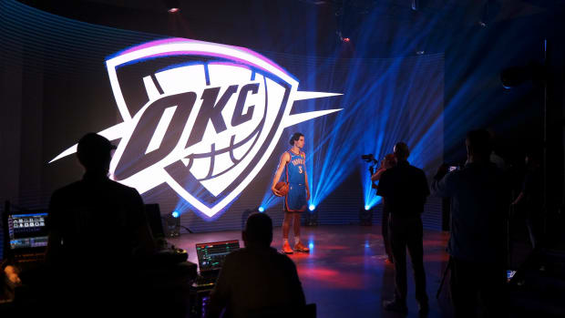
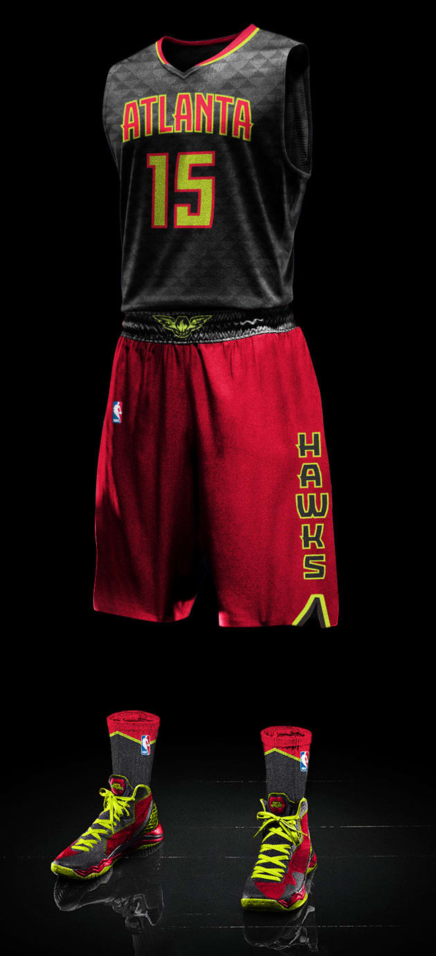
Atlanta Hawks introduce new set of uniforms, including ‘volt green’ color
With all the chatter about the new Atlanta Hawks uniform set—three completely redesigned looks that introduce two new colors—don’t forget about the shoelaces. They signify a major shift in uniform design we’ve never seen in the NBA: the mix-and-match.
Sure, the Hawks offered up a nod to the past in a contemporary way with a “volt green” based off the franchise’s old lime green and become the first NBA team with gray in the color drawer. But that color drawer must now also contain a full sampling of socks and shoelaces as the three Hawks uniforms create a mix-and-match opportunity.
“I was talking with Al Horford,” Hawks chief creative officer Peter Sorckoff tells SI.com, “and walking him through this idea of mix-and-match uniforms. He asked ‘When are you going to have us do that?’ I’m not going to have them do it. The reason I built this is so the guys, as a team, can decide if they ever want to mix and match. It is cool to put it back in the hands of the athletes.”
The mix-and-match concept wasn’t present at the start of the design discussion, but when Sorckoff moved toward a different colored waistband to offset the feather patterned background of the uniform top, the concept started to shift. “When you started to look at it, why don’t you put a red top on gray shorts and it actually looked really good,” Sorckoff. With the NBA’s identity head, Christopher Arena, in on the concept, saying the NBA would allow the unprecedented move as long as colors didn’t clash, the mix-and-match took on a new life.
The Hawks also brought in Stance Socks, the NBA’s new apparel partner for hosiery, to create matching socks for the new package and is working with Nike, Adidas and Under Armour about matching the multiple colors on the footwear.
Sorckoff says that it wasn’t until recently that he heard the story of why the Hawks, in 1970 with Pistol Pete as their star, changed to lime green and blue, a change that lasted only two years. “The franchise was still essentially wearing the colors and uniforms of the team that had played in St. Louis,” he says. “At the time (of the change) they talked about how nobody had ever used the color lime green before.” Forty-five years ago the Hawks tried to give their team a true Atlanta identity with lime green.
“The green was about looking back into our history,” Sorckoff says. “It is a nod to it, but the tone and color today is a very today color. We made the choice to not just resurrect lime green, but we wanted something for this generation that fit with contemporary.”
Of course the green doesn’t stand alone. The Hawks retained “torch red” as a dominant color, but introduced a new third color, “Georgia granite gray.”

Courtesy of Atlanta Hawks
Sorckoff spent time working with a color-focused design group, Rare Design out of Mississippi, to settle on the exact lime green that fit the fashion trends of the future and combined well with red. From there, the duo brought in a deep gray. The gray replaces the current blue by telling a story. Using a Georgia-specific stone tells fans that the team is rock solid and isn’t moving. “You have permission to get emotionally involved in the Hawks,” he says. “There was a real feeling from the research that people were head shy about getting emotionally involved. We wanted to visually symbolize this is a rock you can build your church on.”
Plus, having the only gray in the NBA—“part of this was introducing some colors we could own”—was a nice addition, as was a dark base for that feather pattern to play on.
With the mix-and-match, the green and gray and the head-to-toe color scheme, the new pattern almost gets lost in all this rebranding. The V-shaped pattern derives inspiration from the breast of a Hawk. On the white home uniform, the pattern goes gray. On the gray primary road, the pattern shows in black and gray.
Making such a major shift in the team’s brand all started years ago, Sorckoff says, when the nostalgic Pac-Man logo was “evolved” and introduced as a secondary logo. That was this plan set in motion.
Courtesy of Atlanta Hawks
“Moving the evolved Pac-Man mark into the secondary hole, when we did that, we did it with the full intention of eventually having it take over the primary mark,” he says. “When it took over the primary mark, the plan was to re-imagine the entire uniform package at that point.”
From the major moves of colors, mixing and patterns, Sorckoff says plenty of other smaller points of interest weren’t lost on designers. The new font for the Atlanta on the two main uniform tops, the ATL on the alternate road look and the Hawks down the short side were custom made. “We didn’t want to pull something off the rack,” he says.
Sorckoff even enlisted a tattoo artist to create a script of “True to Atlanta” that goes on a 4-inch tab that folds over on the bottom of the jersey for players to write their name and number on. “It was meant to be and feel really organic,” he says. “It is a nod to our athletes. A lot have tattoos and they are very personal things and tell personal stories. We thought it would resonate.”
2015 NBA draft: SI's Top 60 prospects
Having an asymmetrical short with the pattern and simplified primary logo on one leg and the Hawks lettering down the other leg was also a nod to the past, that 1970 uniform. In that introduction 45 years ago, the Hawks debuted asymmetrical striping, the first time it had ever been done. “As a franchise and brand they were doing really, really innovative things, being the pointy tip of the spear with the visual identity,” he says.
Sorckoff says he reached out to the University of Oregon early in the redesign process to see how the school approached its uniforms. “Obviously Nike is a huge part of it, but a lot of it is driven by the athletes, which surprised me,” he says. “They get the players in and start talking about what should the uniforms look like next.”
Sorckoff did the same, bringing in Horford, Paul Millsap, Kyle Korver and Jeff Teague. “I showed them colors, wanted to get their reactions to it and reactions to the reasons why we were picking and selecting elements,” Sorckoff says. “Our most important focus group has been our team.”
Tim Newcomb covers stadiums, design and gear for Sports Illustrated. Follow him on Twitter at @tdnewcomb.