Pistons upgrade primary logo by going retro
The Detroit Pistons officially unveiled a new logo on Tuesday, marking the first change to the team's primary symbol since 2005.
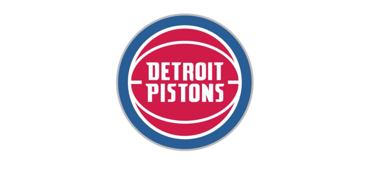
The logo modifies the text-over-red-basketball scheme the team has used for the last 12 seasons, reducing the font size significantly and altering the look of the ball. It closely resembles the team's logo from 1979–1996, which notably includes the Bad Boys era.
"The bold red, white and blue color scheme and basketball icon have withstood the test of time through the evolution of the franchise and the city," the team said. "And now that a new chapter is being written, that evolution continues with a new identity built on the Pistons championship tradition and promising future."
Detroit's 2005-2017 logo was starting to look a bit outdated, and the cleaner retro look is a big upgrade.
The chrome outline on the new logo pays tribute to Detroit muscle cars, the team said. (Did you know they make cars in Michigan?)
Admittedly I'm disappointed the team isn't bringing back the classic teal uniforms with the horse logo. Long live the horse.