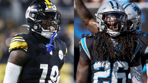
New NFL Uniforms: The Definitive Rankings
We have reached the end of uniform reveal season, still no closer to knowing when football will actually start, but thanks to the powers that be, able to purchase new threads so we can pretend that kickoff is imminent.
Like the draft or the schedule release, analyzing any of this is a bit strange given the uncertainty, but analyze we will. I don’t remember an offseason with so many uniform changes and such a large disparity between quality uniform upgrades and horrendous alterations. One common thread: About half of the six teams that changed uniforms ignored incredible throwback opportunities and instead leaned into the banal, expressionless template that seems to be creeping into sports’ collective uniform consciousness of late.
Without further ado, here are our definitive rankings, to which no sane objections can be made ...
1. Chargers
This was one of the precious few times in life when the finished product matched the emotional sandstorm kicked up by a monumental hype campaign. (Doritos Locos Tacos being another that immediately comes to mind.) With their uniform shift, the Chargers showed they understood both the intimate love affair the general public has with their throwback powder blue uniforms and the blank canvas that accompanies being somewhat of an expansion team in a new market. The result was something responsibly psychedelic, yet ultimately familiar. Various combinations of the powder blue and mustard yellow were pitch perfect, while the additions of the dark and royal blue uniforms were suitable for “Color Rush” type engagements. The numbers on the helmets, a flourish that tickles the fancy of nearly all uniform spotters new and old, helped push them over the top.
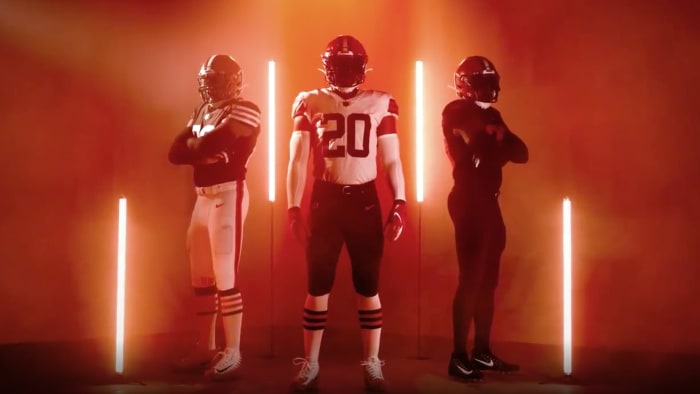
2. Browns
The Browns have gotten themselves into various depths of trouble over the years by trying not to look like the Browns. Since their 1999 reincarnation, all of their uniform shifts seem to be a version of dyeing one’s hair, despite the fact that the original root color is plainly visible. Your team is called the Browns, and really, there are only so many things someone can do about that. It's why reverting to a look that more closely resembles their last run of success in the late 1980s was wise. Long ago, the team found a way to make brown an actionable and palatable color. It’s not like being a team where blue or red is a primary color and the possibilities are endless. The Browns are always going to look like the interior of a 1970s-era ranch house coated in wood paneling and, around that time, someone was smart enough to figure out how it could work for the long term. Timeless is always better.
3. Rams
This may be a surprise here, given that the Rams’ uniforms were roundly panned on social media following their release—mostly (it seems) because they feature a gradient-style fade on the numbers. I’ll use an analogy from my favorite show, Chopped, to try and explain my take on gradient numbers. It’s a lot like the use of truffle oil in cooking, which is panned by many celebrity chefs (looking at you, Aron Sanchez) but can be effective in small doses. I feel like the Rams’ uniform reveal featured a responsible—and not overpowering—dose. Also the white uniforms were not white, but instead bone, which is the same color of Patrick Bateman’s business card in American Psycho. What’s not to like about that? While I also teased the Rams for this, I think there is some credit due for the painstaking detail they went into explaining their thought process. If nothing else, anything that requires that much effort deserves to be applauded.

Tampa Bay Buccaneers
4. Buccaneers
I’ve made my stance on this pretty clear: Give me creamsicle or give me nothing at all. The Buccaneers have already sold out in the hopes that 2020 is a rejuvenative season for the franchise. They’ve thrown all resources behind Tom Brady. They’re luring his friends out of retirement. They’re trading up in the draft to secure a suitable offensive line. This two-year window will either be one of the greatest all-in moments in modern NFL history or a spectacular bust. The creamsicle uniform is the perfect suit of armor for this, as it can be either a power suit to flaunt the team’s arsenal of skill position players or a clown suit to properly accentuate a downward spiral. (Perhaps, at times, both!)
5. Patriots
Brady’s former team is low on the list for two reasons: One is that it’s not really an alteration. The franchise itself said it wasn’t trying to build on the popularity of its color rush uniforms (and the success they had when wearing said uniforms). Two: This would have been a good time to essentially retire the modern, Brady-era look that the Patriots have enjoyed throughout the Bill Belichick era and revert back to the Bledsoe Blues—or something much further in their past. The Patriots have a deep bench from which to draw, including the tri-cornered hat helmets of the 1960s and the totally badass bicentennial font of the 1970s.
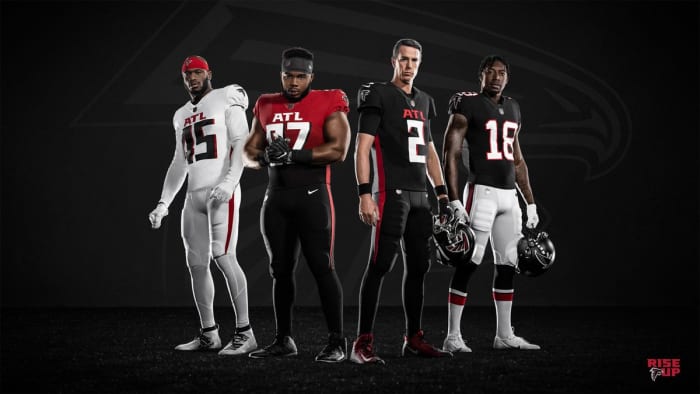
AtlantaFalcons/Twitter
6. Falcons
So this is the perfect example of when gradient goes wrong. The Falcons’ new look was exceptionally disappointing given their phenomenal history of uniforms, including the red helmets of the 1970s and 1980s, and the Dirty Bird uniforms of the late 1990s. They essentially made themselves into the Buccaneers of current times; a team with a look so egregious that there will almost certainly be a countdown clock to their next reveal (hopefully coming sooner rather than later).