The Last of the MLS Originals Joins the Rebranding Revolution
The potential problem with revolutions of a certain kind is that a journey of 360 degrees takes you back to where you started. Not every revolution results in change. Some leave you spinning your wheels.
That’s sort of how it felt in Foxborough, Mass., for a while, at least on the soccer side of Gillette Stadium. MLS was growing and evolving, but the New England Revolution remained anchored in place. A decade of mediocrity was punctuated by one good season—and a record fifth MLS Cup final loss. There was no new stadium, no big signings, next to no relevance and a lingering sense that the pro soccer team in one of America’s premier sports towns was just an appendage of the Patriots, a juggernaut NFL franchise. A brutal 2014 article in Boston magazine was headlined, “The Krafts Are the Worst Owners in the League.” It definitely meant MLS.
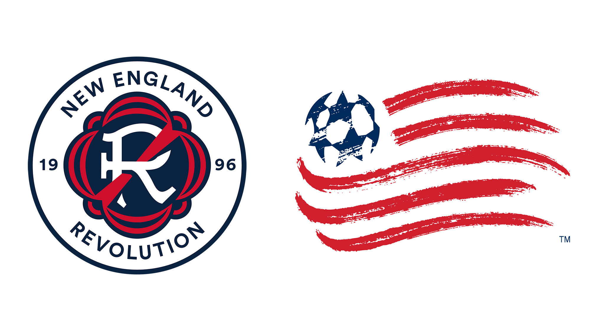
Tradition is great, except when it ties you to something you don’t want to be. So in late 2018 and early ’19, the Revolution kickstarted its evolution. It was time to explore a rebrand. The old name stood out amid a rising tide of FCs. And the “Crayon Flag” logo, as many fans called it, had been around since 1996 and was the only original, inaugural-season MLS badge still in use.

New England Revolution
An unwieldy tribute to the 1994 World Cup logo, the Crayon Flag was dated, oddly rendered and difficult to deploy. Tradition was just about the only thing going for it, and that tradition wasn’t one the club was too eager to trumpet. Under different circumstances, sticking with it might reflect admirable constancy in the face of ephemeral trends. But under New England’s circumstances, it might symbolize a lack of intent or ambition—an inability or unwillingness to grow.
Growth was around the corner. In late 2018, the club broke ground on a $35 million, 68-acre training facility that opened in time for the '20 season. The complex south of Gillette has catapulted the Revs into the modern era and changed how it feels to be part of the club. That independence is poignantly symbolic, not to mention brand-appropriate. Increased investment has flowed toward the academy, the new professional reserve team, a coaching staff led by five-time MLS Cup champion Bruce Arena and a senior squad that clinched the Supporters’ Shield before breaking the league’s single-season points record last week. At this point, 1996 feels like the stone age.
There was no way the Revolution could’ve predicted three years ago, as it planned the first branding focus groups, that the timing would work out so perfectly. But the change makes sense now. Why leave the last original logo behind? Because the Revolution is finally moving forward.
“We’ve thought about this for a while. I think our logo frankly is a bit dated. One thing that was important to me and the club was that we didn’t just want to swap the logo out and say, ‘We got a new logo now. Like us more,’ ” longtime Revs president Brian Bilello says. “We wanted any sort of branding identity change to be introduced along with actual change.
“We thought about a lot of things we want to evolve within our club, and thought the timing was probably right to think about our identity in conjunction with the evolution of the club itself.”

Paul Rutherford/USA TODAY Sports
A new crest and logo system were unveiled Thursday morning (although many had already seen it following a June leak). The Revolution name and colors will remain. Fans were resolute in their support for the moniker, Bilello says. There’s room for pride in individuality, longevity and tradition, and the role the Revolution (the war, not the soccer team) played in Boston’s growth remains a critical part of the region’s identity, the club concluded.
The logo, however, is a much more modern homage to those roots. Rather than using on-the-nose imagery like muskets, tri-corner hats or the pine tree flag—similar symbols are referenced in some smaller, secondary marks—the new primary crest evokes a patriotic, 18th-century feel and theme. The seal at the center features flag-like bunting, an R in a colonial-era font and a slash or “strikethrough,” which the club said symbolizes “defiance” and the “Revs spirit.”
That defiance, which many already associate with Boston sports fans and probably Boston in general, is referenced in the video that accompanied Thursday’s unveiling. Toward the end, an animation reads, “PROUDLY NOT ANOTHER F.C.”
The primary logo that includes the white roundel, team name and "1996" will be the jersey crest starting next season. That’ll officially end the Crayon Flag’s 26-year run. And that’s more than an era in MLS—several clubs have used four logos already. The new oldest crest in the league will belong to FC Dallas, which started wearing its longhorn logo in 2005. The club that has used its initial logo the longest will be Toronto FC, which still embraces the T and shield it wore in its inaugural campaign back in '07. New England will join the Columbus Crew and Chicago Fire in sporting new badges in '22, although each of those other traditional Eastern Conference teams will be using their third all-time.
“The tie to the flag with the bunting and the Americana piece of it, we do think that this isn’t just a [decision] where we threw out the old logo and started from scratch with something. We do think it stays true to the nostalgic piece of who we are,” Bilello says. “It was important to us to be proud of the fact that we are an original 1996 club.”

Paul Rutherford/USA TODAY Sports
Be an original 1996 club, sure. Just don’t behave like one. The Revolution has shown genuine progress on that front over the past few years and so even though there’s no new owner or stadium—often the catalyst for a brand refresh—sufficient ground has been covered to validate and explain the move. New England’s MLS roster spend has risen around 56% over the past five years. This season, although its total payroll still falls below the league average according to MLS Players Association figures, it fields two of the league’s 25 highest-paid players in Carles Gil and Gustavo Bou (and the Revs are getting their money’s worth). Only six clubs have multiple men on that list.
The Supporters’ Shield, which honors MLS’s best regular-season record, is the first significant trophy captured by the Revs since 2008 and the first through league play, period. If Arena’s rampant side isn’t the heavy favorite to lift MLS Cup on Dec. 11, it’s only because one-game playoffs are tough to predict or because of the club’s uniquely tortured history. Regarding the former, New England at least will have home field advantage throughout—it’s 12-1-3 at Gillette this season. Regarding the latter, perhaps it started to leave some of that history behind Thursday.
“Generally speaking, we think this is a new Revolution. We think this is a very different club than the one that existed a few years ago,” Bilello says. "We wanted to anchor that in a brand identity change as well. … I think we want to signify to our fans that what you're seeing in 2021—that’s the club we want to be. That’s the club we invested in, and that’s the club we’ll continue to invest in.”
More Soccer Coverage: