Angels Sit at Top Half of City Connect Jersey Rankings
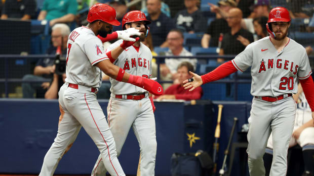
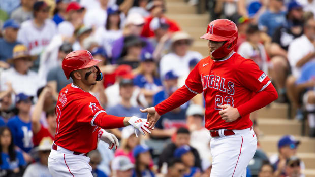
It is super hard to mess up the uniforms that the Los Angeles Angels have been dawning for quite some time now because most of the time, they are using a simple color scheme made up of red and white. This allows their players to get creative with their cleats and accessories but the jerseys stay simple for the most part.
Older fans may remember when the franchise first made the switch to these colors in 2002 and used different marketing catchphrases such as 'The Hunt for Red October' and 'Red Dawn.' We have also seen a lot more of one of the Angels' newer color ways in their City Connect uniforms.
These feature a nice cream shade all around and really allows the embroidering of the last names and jersey numbers to pop. The idea here was that these jerseys were meant to represent the beach and outdoor lifestyle that comes with living in the Los Angeles/Anaheim region.
Updated rankings have been rolling out for all the city connect jerseys all around the MLB and your Angels landed in the top eight in a list made by Bleacher Report's Brandon Scott.
"The Angels' design is inspired by California beach culture. Last year, when they unveiled the City Connect uniforms, players like Mike Trout and then Angels pitcher Noah Syndergaard, were photographed in the uniforms with matching surfboards on the beach."
"Even the "Angels" font across the chest takes inspiration from surf brands, as do the stripes on the sleeves. The cream, or off-white base is a nice and unique switch from either the customary white or gray uniforms we're used to seeing in baseball. There is a fair criticism that the alternates are too similar to the everyday uniforms, but my response would be that the everyday uniforms are actually pretty good-looking too."
(Via Bleacher Report)
We look forward to seeing them continue taking the field in these!