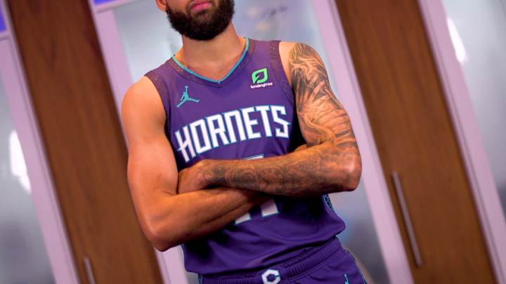
Reactions to the Hornets' New Statement Edition Uniforms

James Plowright 8/10
Definitely a little more to them than the leaked version of the jerseys. I've been screaming for honeycomb side panels for some time now. Adding the subtle honeycomb trim on the neck/arm line is a nice, unexpected feature. I like these a good bit more than the leaked version. I've always liked the purple jerseys, changing to Hornets from CHA was a no-brainer move that will go down well with the fanbase. Overall, a sleek jersey with just enough je ne sais quoi to make them stand out
Austin Leake: 7.5/10
I like the design they had going for them, but it might be a little plain. I like how they changed from CHA to Hornets. I think the entire fanbase can agree with that. Adding pinstripes would've been nice. Overall, it's solid, but probably more on the average side of things.
Israel Omondi 8/10
I’ve always loved how the purple looks. The teal outline and Hornets logo on the side of the shorts really pop out. The teal, honeycomb pattern on the side of the jersey was also a pretty nice addition. Additionally, I wasn’t too harsh on the CHA abbreviation last year but I’m glad that won’t be a talking point among fans anymore. The only reason this jersey won’t get a higher rating from me is because it is a bit bland, but I can’t judge them too harshly because it appears that Nike’s statement jerseys don’t allow for much creativity.
Eric Barnes 7/10
Would have preferred a pinstripe theme. I do like the honeycomb pattern on the side. But it does feel like they just added that honeycomb pattern to their old purple jerseys.
Ian Black 6.5/10
“Safe” is the word I would use to describe these statement jerseys. The Hornets’ shade of purple is a bit difficult to build a modern jersey around without some bells and whistles. That shade of purple is in need of lighter-colored accents, as it’s a bit drab with such a to-the-point style. The black base to the side stripe was the most interesting choice in my opinion, I would’ve gone for more of the teal or maybe even some white for some pop. Glad the “CHA” is gone though!
You can follow us for future coverage by liking us on Facebook & following us Twitter:
Facebook - All Hornets
Twitter - @All_Hornets and Schuyler Callihan at @Callihan_.

Schuyler Callihan is the publisher of West Virginia On SI and has been a trusted source covering the Mountaineers since 2016. He is the host of Between The Eers, The Walk Thru Game Day Show, and In the Gun Podcast. The Wheeling, WV native moved to Charlotte, North Carolina in 2020 to cover the Charlotte Hornets and Carolina Panthers.