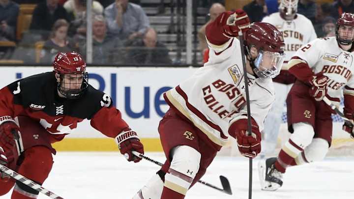
BC Hockey to Debut 1960s-Era Sweaters Friday Night

Photo Courtesy of BCEagles.com
First it was football. Then basketball. Now it’s hockey’s turn to throw it back with the uniforms.
Last October, Boston College football debuted early-1980s-era uniforms with the old school logo and a deeper gold tone. After wearing them against Louisville, the jerseys became so popular that BC wore them twice more during the season, including for the College Gameday matchup with Clemson. In August, they announced that the uniforms would return for the 2019 season, but, surprisingly, they’ve only been worn once.
While basketball didn’t quite go full throwback last December, the program dropped new thread with a script “Eagles” on the front, reminiscent of the uniforms from the 1970s.
Fans were left wondering when, or if, BC hockey would hop on the train. That question was answered Monday afternoon when the Eagles media tweeted out that the team would be sporting throwbacks from the 1960s on Friday night against UConn.
The official uniforms haven’t been revealed yet, but BC Hockey’s Twitter account has leaked glimpses of them.
From what’s been shown, it appears as though they aren’t embracing the deep gold quite as much as the football team did. But the uniforms will include the old logo on the left chest. This looks fine, but it does create a problem for two player: David Cotton and Graham McPhee. Both wear letters for the Eagles, so that area of the uniform looks quite crowded (they’ve been the two players featured in the previews).
The piping definitely looks cleaner than today’s uniforms. It’s a simple three-stripe design, two maroon and one gold. From what I can see, the rest of the sleeve looks like it is just white.
The uniforms will also feature maroon laces and a maroon collar, as well as the Hockey East patch on the right chest.
Right now, it seems like the main area of secrecy is the chest design. Will it say “Boston College” or “Eagles”? What will the font look like? Cotton and McPhee’s previews haven’t revealed much, but I’m leaning towards “Eagles” being on the front. In the five-second clip of McPhee, if you freeze it right when it starts, you can see the start of an “E” below the conference emblem, which is logical position if “Eagles” is going to slant down across the uniform. Also, when the shot pans out a bit on McPhee, there is too much white space to fit an arched “Boston College” on there.
Throwin’ it way back to the early 60’s on Friday night
— BC Men's Hockey (@BC_MHockey) November 6, 2019
🎟 https://t.co/P7WSEMHvaM#WeAreBC🦅 pic.twitter.com/fSETM8rKDj
Also, the piping around the waist hasn’t been shown, but the 1963 uniforms I found online have a five-stripe design in a similar fashion as the three stripes on the sleeves. The five stripes should also be expected to make an appearance on the socks, according to those same 1963 uniforms.
The uniforms will officially be released for purchase Friday morning at the bookstore and are also available at Friday night's game, the first half of a home-and-home with UConn.
