New Look for New York? Knicks' Logo Gets Subtle Makeover (Again)
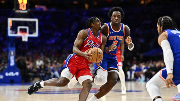
The New York Knicks apparently decided to tip off New York Fashion Week a few months early.
Chris Creamer, founder of SportsLogos.net noticed that the Knicks have slightly tweaked their iconic logo in each of the last two years. For last season, the emblem's shades of blue and silver were slightly darkened as the Knicks embarked upon a 47-win season and their first playoff series victory in a decade. Those hues will be retained for the 2023-24 logo, which features lighter shades of orange.
With the changes mostly unnoticeable to the naked eye, Creamer detailed the updates in a colorful demonstration.
New York has used some variation of their current logo, a basketball hovering below lively fonts bearing the team name since 1964 when it transitioned away from its original "Father Knickerbocker" branding. Modern fans are used to seeing a silver triangle behind the logo, which was added nearly 30 years later. The most noticeable update since that adjustment was removing black from the primary logo's color scheme in 2011, though the Knicks have continued to wear black uniforms since then.
Creamer, whose site has been a prime destination for sports fans since he founded it in 1997, even notes that the Knicks aren't the only NBA team to slip aesthetic changes past their fans' noses: the Los Angeles Lakers and Sacramento Kings tweaked their respective shades of purple and gray, though the former also introduced a minimalist alternate logo.
Geoff Magliocchetti is on Twitter @GeoffJMags
Want the latest in breaking news and insider information on the Knicks? Click Here.
Follow AllKnicks.com on Twitter.