
Ranking the 10 Worst Nike NBA City Edition Uniforms of All Time
Love them or hate them, basketball fans can't ignore the NBA Nike City Edition jerseys. Every year, Nike partners with each team to create a one-off uniform honoring the city. After almost a decade, it seems like everyone has run out of good ideas.
Earlier this week, we ranked the ten best Nike City Edition uniforms. Unfortunately, there are far more bad options. Interestingly, half of our list comes from the 2024-25 season, which was apparently a low point for the program. Below are the ten worst NBA Nike City Edition uniforms ever.
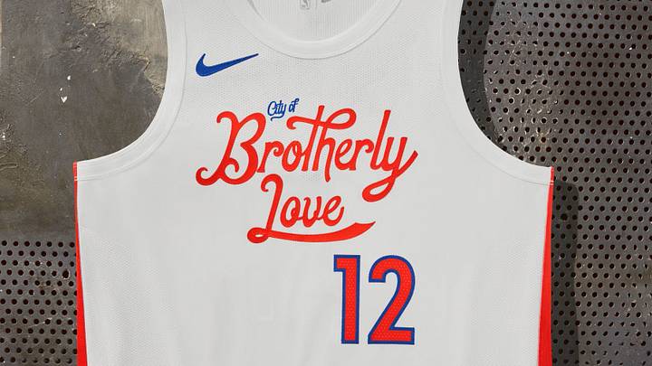
10. Philadelphia 76ers "City of Brotherly Love"

The Philadelphia 76ers' 2022-23 "City of Brotherly Love" uniforms were a good concept with poor execution. The hand-drawn script and minimalist design language made the uniforms feel cheap.
A different font would have drastically improved these uniforms. But then again, squeezing in four words across the chest is a lot.
9. Minnesota Timberwolves "Wintry Lake Wonderland"

The Minnesota Timberwolves' 2024-25 "Wintry Lake Wonderland" was a winter-inspired follow-up to the previous year's "Land of 10,000 Lakes" uniforms.
The Minnesota wordmark is barely visible and the white-on-white numbers had to have frustrated officials and announcers alike. Thank goodness for the Timberwolves' recent rebrand.
8. Cleveland Cavaliers "Cleveland Museum of Art Pop"

The Cleveland Cavaliers' 2024-25 "Cleveland Museum of Art Pop" is another example of a cool concept that missed the mark. We're all for civic pride and supporting the arts, but did the Cavaliers have to ditch their beautiful color palette?
It's not that the uniforms were hard on our eyes, but the team looked unrecognizable in blue and white. Also, we didn't need "The LAND" across the chest again.
7. Los Angeles Lakers "Magic Johnson (Showtime)"

The Los Angeles Lakers' 2018–19 "Showtime" uniforms continued the Lore series with a tribute to Magic Johnson. Even mentioning these alternate uniforms in the same breath as the 1980s uniforms is disrespectful.
The heavy-handed "Los Angeles Lakers" wordmark across the chest, pinstripes, and black detailing made these uniforms the worst in Lakers history.
6. Atlanta Hawks "Lift as We Fly"

The Atlanta Hawks' 2023-24 "Lift as We Fly" uniforms were both a reach and uninspired. Conceptually, it had something to do with the community helping each other out. But then the lowercase "atl" had to have taken all of one minute to design. Lastly, there is nothing cool about ditching your team colors.
5. Charlotte Hornets "Gold Rush"

The Charlotte Hornets 2022-23 "Gold Rush" uniforms were a nod to the city's history as home of the first U.S. Branch Mint and the Carolina Gold Rush of the early 1800s.
Already unsure what that has to do with hoops, the uniform got worse with the airport code "CLT" across the chest and an ugly color palette. Teal remains undefeated in sports uniforms, and the Hornets would be wise to wear it every chance they get.
4. Dallas Mavericks "American Blues"

The Dallas Mavericks' 2024-25 "American Blues" celebrated American music culture and spirit of Dallas. Not only were the uniforms painfully bland, but they were just one of multiple Mavericks uniforms featuring similar designs.
It's like the team overcorrected from the glorious 2019-20 "Art + Basketball" uniforms and never came back. We need more of the Sprite-inspired color palettes.
3. Washington Wizards "The District"

The Washington Wizards' 2024-25 "The District" uniforms were a low point for a franchise with more good-than-bad City Edition alternates. Getting away from the team's primary colors was already a mistake.
But the black-and-anthracite uniforms with red, bronze, and patina accents were far too busy. As a history buff, I appreciate the tribute to our nation's capital, but there had to have been a better way to do it.
2. Chicago Bulls "United Center 30th Anniversary"

The Chicago Bulls' 2024-25 "United Center 30th Anniversary" was a celebration of the arena that dominated the 1990s. Dressing like your home arena is strange, and no team deserves a victory lap less than the Bulls—Jerry Reinsdorf hasn't built a championship team since 1998.
Not to mention, the white, grey, gold color palette was a further dilution of a once iconic brand identity. Bulls fans deserve better.
1. Denver Nuggets "Mile High Mountain Majesty"

The Denver Nuggets 2024-25 "Mile High Mountain Majesty" uniforms gave us altitude sickness. We appreciate the rainbow effect as an homage to the team's old uniforms, but it made the numbers across the chest hard to read. Speaking of numbers across the chest, why are there numbers across the chest? We get it; elevation exists.
The Nuggets never had to resort to this, as they have one of the best uniform rotations and catalogs in the league. With so many different iconic looks to pull from, the Nuggets' decision to wear these uniforms throughout a season was maddening.
Stay locked into Sports Illustrated's Jerseys On SI for all your uniform news from the NBA and beyond.
 Add us as a preferred source on Google
Pat Benson covers team uniforms and player apparel for Jerseys On Sports Illustrated. Pat is a trusted voice for fans, regularly breaking news, spotlighting important stories, and interviewing the biggest names in sports. Pat also covers the footwear industry and has authored "Kobe Bryant's Sneaker History (1996-2020." You can email him at 1989patbenson@gmail.com.
Follow Pat_Benson_Jr