ACC Football Uniform Rankings

As we slip deeper into the summer, the football content machine slowly winds down. Which means we naturally have to start generating some controversy and/or discussion to keep the content gods happy. One of the best ways to do this make lists and rank things. Now, some people think these lists are a lazy way to make content and inspire discussion. So without further ado, let’s get into the list.
For this week’s list, I ranked the uniforms of the ACC. Not that it matters, but I’ll explain my criteria. This ranking will take into account each school’s primary home (color) and away (white) uniform. When discussing uniforms, there has to be a balance of new uniqueness and timelessness. Schools that have multiple alternates or throwbacks will be taken into account, but those will not be the primary deciding factor. Additionally, these rankings take into account the entire ensemble of the uniform: helmet, jersey, pants, socks, and shoes.
D-Tier: Generally Boring or Unimaginative Uniforms - Georgia Tech, Duke, Boston College
Even with new uniforms, BC can’t escape the bottom of the barrel. BC’s new ensemble from Adidas is an improvement from the normal Under Armour template BC adopted before switching to the throwback style that Adidas brought over. But it’s a generally underwhelming look, with no alternative helmets, jerseys, or pants (yet). Duke’s variety of helmets keeps them out of the basement here, but the Blue Devils’ jersey and pants ensembles are among the more boring in all of college football. Luckily, Duke can mix and match several different colors of pants with many different helmets. Last in the bottom tier is Georgia Tech, who like BC was saved by Adidas from Russell Athletic (puke) only a few years ago. Unfortunately, Adidas has not had the chance to really flex their muscle with the Yellow Jackets yet, but until they bring back the honeycomb helmets, GT’s ceiling is limited.
C-Tier: Too Tight, Too Much Going On - NC State, Louisville, Syracuse
Generally, I dislike Adidas’ older style of uniforms, which look extremely tight-fitting. Both NC State and Louisville employ these looks and it just doesn’t look right. The Wolfpack’s uniforms are just too busy and some of their alternates are big misses. Louisville can deploy some solid looks, but they’re just not exciting. This may be an unpopular opinion, but I liked Syracuse’s last iteration of their uniforms, with the big numbers and diagonal lines through them. It gave a generally boring team a unique, futuristic identity. But now, they just have stripes and the school name, very reminiscent of the Cleveland Browns’ uniforms from a few years ago.
B-Tier: Solid Execution of Basic Design - Miami, Clemson, Wake Forest
These teams have above-average ensembles because they don’t try to do too much and it works. Wake has one of the better color combos in sports and they use it well; their blackout kit is fantastic. But even the Demon Deacons’ helmet varieties can’t get them any higher. I wish Clemson would try something a little more interesting (besides wearing purple uniforms once a year), but I don’t want them to entice even better recruits with cooler uniforms so I’ll shut up. I feel like most people would put Miami higher since they returned to their simplistic but historic design with Adidas. However, what the U added in nostalgia, they lost in creativity. Granted, Nike got a little too ambitious with the Hurricanes, but their unique color scheme is being woefully underutilized.
A-Tier: Great Color Schemes Mixed with Unique Aspects: Pittsburgh, Virginia Tech, Virginia
These three Coastal Division squads rely on unique features to get them among the best in the conference. Pitt had some great looks when they went with navy and gold, but switching back to the classic bright blue and yellow kicks it up a notch. Their unique number pattern representing the Cathedral of Learning is an awesome detail, but their “steel” ensemble keeps them out of the top tier. Next are the Old Dominion schools. Tech has one of the most unique color schemes in college football and uses it well in all aspects of their uniform, with tons of combinations of helmets, jerseys, pants, and socks. They can also get outside their norm with throwback ensembles or an all-black look that looks fantastic at night. Finally, the Virginia Cavaliers sneak in with a classic color pairing, a unique font, and flexibility with all aspects of the uniform.
S-Tier: Elite Color Combos with Iconic Identifiers: North Carolina, Florida State
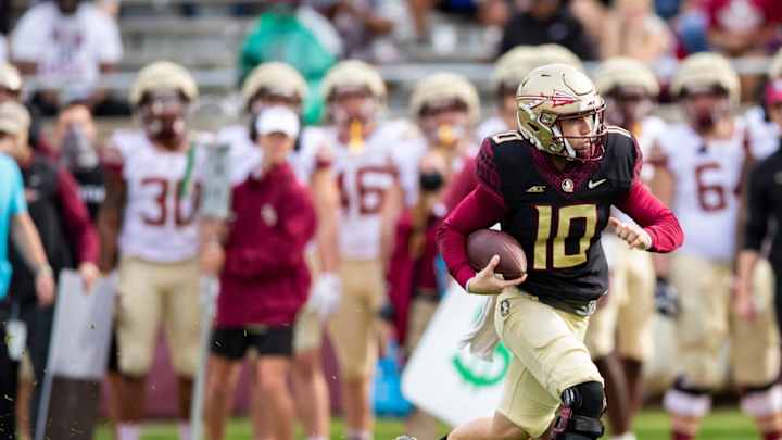
Florida State comes in at number 2 in our rankings, with an iconic color scheme and general uniform theme beautifully married with modern themes. The spear on the helmet is elite and the patterns on the sleeve look awesome. Finally, we have to go with the best color in the conference: Carolina Blue. A few years ago, Nike got a little over their skis with the Tar Heels, but their return to a more classic look (with the help of the Jordan brand) and the incorporation of the argyle pattern gets North Carolina to the top spot. The all-whites are exceptionally clean, and the navy blue is a nice change-up. Obviously, Jordan shoes help complete this elite look.
