Dave Feit: Underwhelming Effort on Nebraska’s Alternate Uniforms

In this story:
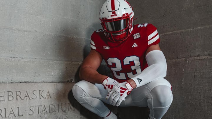
Nebraska released its alternate uniforms for the 2023 season, to be worn against Northwestern on Oct. 21.
Wait … can we even call this an "alternate uniform"? To me, that implies tweaks or changes to the helmet, jersey, and/or pants. This is more of a one-off jersey, intended to celebrate the 100th anniversary of Memorial Stadium.
The jersey gives a very subtle wink to the first ever game played at the stadium (against Oklahoma in October 1923) when Nebraska wore blue jerseys because a) the visiting Sooners wore a shade a red that was very close to Nebraska's, and b) white road uniforms were not yet standard.
There's no reason to go through the usual routine of looking at every piece of the uniform. Other than the jersey, everything else is the same.
Heck, for fans sitting above, say, row 50 the jersey will probably look the same too. There's a very nice looking "100 years" patch. The inscriptions from the four corners of the original stadium* are printed within the sleeve stripes.
*A quick refresher on those inscriptions.
- Northwest corner: Courage; Generosity; Fairness; Honor; In these are the true awards of manly sport
- Northeast corner: Their Lives they held their country's trust; They kept its faith; They died its heroes"
- Southeast corner: In commemoration of the men of Nebraska who served and fell in the nation's wars.
- Southwest corner: Not the victory by the action; Not the goal but the game; In the deed the glory"
The player's left shoulder has the Northwest and Southeast inscriptions inside the stripes. The Northeast and Southwest inscriptions are printed in the stripes of the right shoulder.
And then there's one notable difference: a thin blue outline - probably about the width of a pencil eraser - around the numbers.
That's it.
I don't know how the design and approval process works for alternative uniforms. But it feels like there was a ton of back and forth: a lot of Adidas saying, "how about this," and NU responding "no, we don't like that," until they were up against a deadline.
At that point, both sides agreed to slap a blue outline around the numbers, put the stadium inscriptions inside the sleeve stripes, and send it off to the factory overseas.
This jersey is such an underwhelming effort for such a momentous occasion. It feels like more time and effort went into the release video* than the actual design.
*Without a doubt, the video is the best part of the entire effort. Featuring a voiceover by John "Voice of God" Facenda of NFL Films, we are treated to treasure trove of historic photos and video. Three families who have had season tickets for over 70 years are featured. Have a tissue ready when the sweet grandma talks about the organist playing "There Is No Place Like Nebraska" at her grandmother's funeral.
To me, there are two very obvious ways Adidas and Nebraska could have gone to commemorate the 100th anniversary of Memorial Stadium that would have been much better than what we got:
1. Embrace the "Nebraska wore blue uniforms in the first game at the stadium" theme, and go all-in.
I really like that Nebraska is referencing what was once an obscure, did-you-know piece of trivia. But they're only sticking their pinkie toe into the blue waters. It's your centennial celebration! Go big!
Previously, I wrote about the historical significance of that first game. The amazing Brett Baker made some mock-ups of what it would look like if NU wore blue for one game. As Twitter user "Dokktor Dogo" pointed out, the shade of blue the Huskers likely wore in 1923 would have been a much darker, almost navy blue hue than the bright blue used in the original version.
2. Bring back the 2018 alternate uniforms - with some enhancements.
Do you remember the faux-back uniforms Nebraska wore in 2018? The "Memorial Tribute" uniforms were inspired by the uniforms the 1923 team wore, with several design elements - jersey numbers, pants colors, and "In the deed the glory" on the back nameplate - drawn from Memorial Stadium.
Many fans didn't care for the white helmets that were supposed to look like old stitched leather helmets.*
*Raise your hand if you referred to them as CPAP masks or jock straps.
So, we enhance and improve upon what was there. Maybe we ditch the stitched leather look and wear the traditional helmet (with a grey facemask!). Or what about a solid red helmet for some pop?
My point is, with a little refinement, Adidas could have made one of their best alternate uniforms even better. And Nebraska would have a beautiful uniform to truly honor the 100th anniversary of one the greatest stadiums in college football.

Dave Feit began writing for HuskerMax in 2011. Follow him on Twitter (@feitcanwrite) or Facebook (www.facebook.com/FeitCanWrite)