Watch: Yankees broadcasters rip on Twins new 'M' logo during 6-1 loss
As they looked for something to talk about as their Yankees were smashed by Sonny Gray and the Minnesota Twins, the lead New York broadcasters fixated on the Twins' new logos.
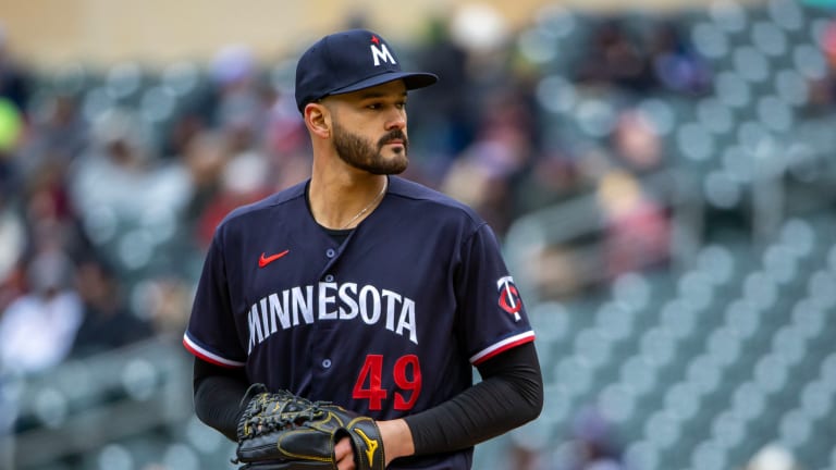
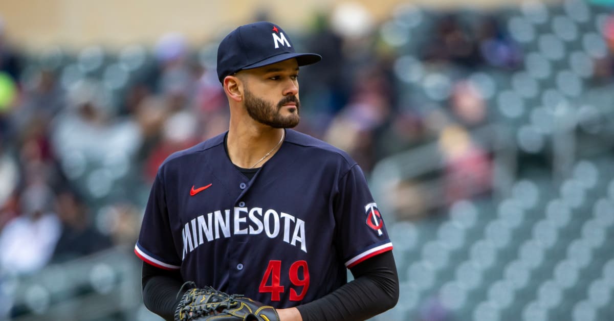
YES Network hosts Ryan Ruocco and Jeff Nelson took time out of their commentary for the Twins' 6-1 win at Target Field to remark about the new "M" logo that now adorns the Twins' hats on its road and home alternate uniforms.
Needless to say, they're not fans:
"The 'M' on the cap is awful," Ruocco begins.
"I agree," Nelson responds: "I was waiting for someone to bring that up."
Ruocco continues: "It looks like the Marlins 'M', it looks exactly like the Marlins 'M' and I understand the star is supposed to be the North Star and that's a thing here ... but ... that is, just dreadful."
The "M" hats weren't out on Monday night as the Twins were playing in the white home uniform with the "TC" logo hats, a logo which at least have Ruocco's approval, describing it as "iconic."
As for the complaint that the "M" looks "exactly like the [Miami] Marlins' logo": Ruocco is right that they are absolutely identical in a sense that they both feature the letter "M."
Minnesota Twins/Miami Marlins
The old Marlins logo you say? Closer, for sure. But "exactly like it"? Hmmmm yeah no.