
The 5 Most Beautiful Baseball Card Designs of the 1950s
In this story:
When Topps launched its 2026 flagship set, the company celebrated its 75th anniversary by honoring its roots. Topps did an amazing job paying homage to Bobby Shantz, the oldest living MVP at 100, as he opened the very first 2026 Topps pack (Watch the moment here).
While 2026 marks 75 years of Topps baseball, the flagship set heavily spotlights the iconic 1952 Topps set. 1952 Topps truly put the company on the map, and it is easily the most historically significant and influential baseball set ever created. It single-handedly transformed baseball cards from a niche hobby into a mainstream American phenomenon.

But many collectors forget that 1952 wasn't actually the beginning. Topps debuted its first baseball set in 1951 with a small, uninspiring design meant to double as a playable card game.

Why, then, did Topps center its 75th anniversary around a 74-year-old set while largely ignoring its true debut? Because the 1952 set is a masterpiece, and the 1951 set is not. Visual appeal alone doesn’t make a card iconic, but it certainly makes a huge difference.
The 1952 set exploded in popularity and remains so sought after today because of its gorgeous hand-painted portraits and vibrant colors. Conversely, the 1951 set is largely ignored due to its clunky aesthetics and uninspiring checklist.

However, Topps did not hold a monopoly on beautiful card designs in the 1950s. The decade saw fierce competition between Topps and Bowman, with each company constantly trying to outdo its rival. Much like the 1990s insert boom pushed manufacturers to innovate, this bitter 1950s rivalry inspired some of the most stunning sports cards ever printed.
Over time, these great designs transcended the hobby to become miniature works of art. While any aesthetic ranking is entirely subjective, these five sets stand out as the most beautiful baseball card designs of the 1950s.
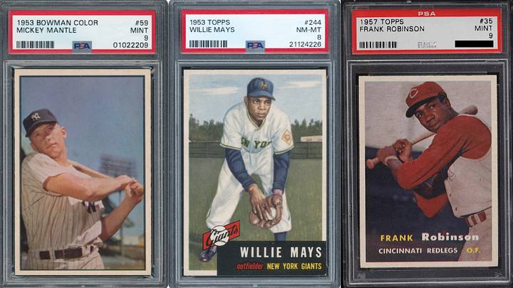
5. 1957 Topps

Why it Stands Out: The 1957 Topps set marked a turning point in baseball card history as it is the first flagship Topps set to feature full-color photography. Rather than relying on painted portraits, Topps let the photographs do the heavy lifting, creating a cleaner, more modern look. The simple white borders, facsimile signatures, and vibrant action shots helped establish the photographic style that would dominate baseball cards for decades. The set also introduced the new 2½-by-3½-inch card size, which remains the industry standard today.
4. 1953 Bowman Color Baseball

Why it Stands Out: : This was the first baseball card set to use actual full-color photography. The card fronts feature no player names, team names, positions, logos, or facsimile autos. Bowman removed everything to let the photography speak entirely for itself. The cards almost resemble framed photographs rather than typical baseball cards. Many collectors consider this set design the most underrated masterpiece of the 1950s.
3. 1952 Topps Baseball

Why it Stands Out: There aren’t any card designs that are more recognizable than 1952 Topps. Designed by Topps executive Sy Berger, the painted portraits, colorful backgrounds, team logos, and facsimile autographs became the standard for future baseball cards. The jumbo size of the cards dwarfed the tiny tobacco cards and smaller Bowman cards of the era. These were also the first cards to provide fans with a full statistical breakdown of the previous season along with career totals on the card backs.
2. 1956 Topps Baseball

Why it Stands Out: This 1956 Topps card design is incredibly creative and aesthetically pleasing at the same time. Each card featured a "split-screen" effect with a massive close-up portrait paired with a smaller, secondary action shot. The set integrated full stadium backgrounds, fences, and beautiful green grass behind the portraits, immersing the players directly into a real game environment. Topps fully committed to a horizontal presentation on the front, while making the back fun to look at too with illustrated cartoons and fun facts.
1. 1953 Topps Baseball

Why it Stands Out: Facing a threat from Bowman’s beautiful 1953 photography, Topps executive Sy Berger hired real canvas artists to hand-paint every single player image. Multiple drafts were created for many cards, and Topps did not accept anything less than an iconic image for each card. Each painted portrait in the 1953 Topps set feels worthy of being framed.

David is a collector based in Georgia and a lifelong fan of the New York Yankees, New York Giants, and New York Knicks. He is an avid sports card collector with a strong passion for vintage baseball cards and vintage on-card autographs. David enjoys obtaining autographs through the mail and loves connecting with other knowledgeable collectors to discuss the history and evolution of the hobby. He also previously wrote about the New York Giants for GMENHQ.com