
10 Reactions From Week 8 College Football Uniforms
In our weekly rankings of the best uniforms in college football, we warned of a great disparity between the top and bottom of the list. Luckily, even the uniforms we were unsure about turned out to look solid on Saturday.
Still, there is a lot to unpack in Week 8's uniforms. From throwbacks to color-rush uniforms, we have reactions. Below are our ten observations from this weekend in college football.
Boise State Doesn't Miss

The Boise State Broncos don't miss. In the heat of battle, they don't miss. Fans should always make a point of tuning in to Broncos games, even if they're not playing on the blue turf, because they will treat you to an aesthetically pleasing uniform set. Find the CW or USA Network on your TV and lock in.
Kansas State Brings Back Purple Helmets

The Kansas State Wildcats wore purple helmets for the first time since 1988 (one year before their coach was born). I found that hard to believe. Even more impressively, they look incredible. The Wildcats have to keep the purple helmets in their rotation.
Kentucky's Ugly Grey Uniforms

The Kentucky Wildcats have a consistently underrated uniform rotation. However, they should ditch the grey jerseys and pants. It's giving 2014 vibes, and the Wildcats have countless other options that look better. The grey uniforms are unbecoming of a playoff team.
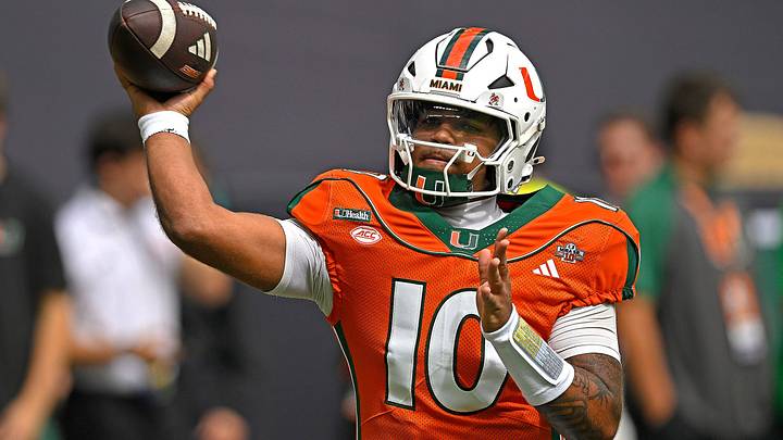
Miami's Glorious Throwbacks

The Miami Hurricanes won the weekend in uniforms. Adidas recreated throwback uniforms to celebrate the 25th anniversary of their National Championship team. How hard was that? Miami is leaving adidas for Nike, but the throwback uniforms should be permanent.
North Carolina's Exhausted Throwbacks

The North Carolina Tar Heels have some of the best primary uniforms and one of the worst throwbacks in the sport. So, why do they keep wearing the throwbacks so much? Please put them away and stick with the "NC" logo and argyle patterns.
Oklahoma State's Oversized Pistol Pete Logo

I would never try to tell the Oklahoma State Cowboys how to dress. That's like telling Michelangelo how to create art. But Pistol Pete is such an incredible retro logo; the sport needs to see him more often.
Oregon Hits New Low

The Oregon Ducks hit a new low in the Generation O era. The Modern Classic uniform sets have had very few misses. But yesterday's yell-white-white set was as uninspired as the team's performance. If they had worn yellow pants, another one of my predictions from May would have been correct.
SMU Makes Dallas Proud

Surprisingly, a vocal faction of fans doesn't like the SMU Mustangs' Dallas-inspired uniforms. Hopefully, hanging 59 points on Cal will help the uniforms grow in popularity. The retro helmet decal and Dallas script across the chest make a great "City Edition" uniform.
Tennessee Needs Orange Pants

The Tennessee Volunteers quietly changed the color of their jersey patch sponsor to orange for improved visibility. But the more pressing issue is the absence of orange britches. I think orange pants could have saved that winnable game against South Carolina. Either way, adidas and Tennessee are still crushing it.
UCLA Brings Back Powder Blue

It annoys me that Jordan Brand relies too heavily on throwback uniforms for its select teams. But the upside is that it helps my campaign to bring Powder Blue and Clarendon numbers back to the UCLA Bruins. Compare this shade of blue to their primary set, and it's no debate. Bruins fans are so close to the golden years of the 1990s; I can feel it.
 Add us as a preferred source on Google

Pat Benson covers team uniforms and player apparel for Jerseys On Sports Illustrated. Pat is a trusted voice for fans, regularly breaking news, spotlighting important stories, and interviewing the biggest names in sports. Pat also covers the footwear industry and has authored "Kobe Bryant's Sneaker History (1996-2020." You can email him at 1989patbenson@gmail.com.
Follow Pat_Benson_Jr