Ranking the 10 Worst NBA Jerseys of All Time

This week, The Crossover published a list celebrating the 30 best jerseys in the history of the NBA. It’s full of classic designs like the Celtics and Lakers, nostalgic retro looks like the ’90s Pistons and Pacers and bold modern choices like the Timberwolves and Heat’s new City Edition uniforms.
But sometimes it’s more fun laugh at uniforms gone horribly wrong than to praise basketball’s finest sartorial choices, which is why we decided to also rank the 10 worst jerseys in NBA history.
10. Hawks (2015–present)
Staring too long at the triangle pattern or the neon numbers is sure to give you a splitting headache.
9. Knicks (1979–83)
Putting the number above the team name has always been a weird move.
8. Warriors (1997–2002)
The lightning bolt really makes these look like they were stolen from a kids sports movie. Honestly, the jerseys Lil Bow Wow’s team wore in Like Mike are better than these.
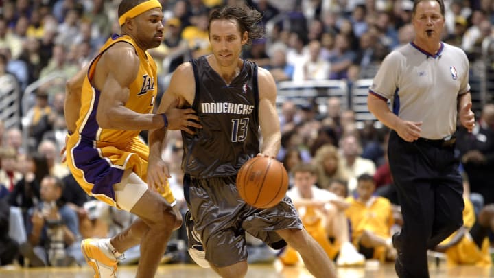
7. Mavericks (2004–09)
The Mavs have never had particularly pretty jerseys but these are very bad. They’re not the worst ones the franchise has ever worn, though, because... well, just keep scrolling.
6. Wizards (2006–09)
Incredibly, the Wizards were not the only team in the mid-2000s to go with shiny gold uniforms. Fortunately for Washington, the Wiz’s gold unis weren’t nearly as bad as the Kings’.
5. Cavaliers (1994–97)
The ’90s were a dark time for NBA aesthetics. Teams around the league ditched the straightfoward designs that served them well in the ’80s and went with more experimental looks. Some—like the Pistons, Raptors and Grizzlies—later became cool retro looks beloved by 21st century fans. Others, like this Cavs abomination, were thankfully forgotten.
4. Spurs (Military Appreciation Night)
As a nod to the many military members who live in and around San Antonio, the Spurs have worn several different camo uniforms for various Military Appreciation Night promotions. None of them have been good.
3. Mavericks (2003)
These are so quintessentially early-2000s. I definitely wore shorts made of this shiny Nike material as an 11-year-old playing in the rec league at my local Boys & Girls Club. They were not fit for an NBA team to wear, however.
“They looked like wet garbage bags,” Cuban said in 2013, “but I took them off the market after one game.”
2. Kings (2005–07)
Yes, the garish gold-on-gold look is the main issue here, but do not sleep on the purple and silver sash-like stripe on the right side.
1. Hawks (1970–72)
The pistachio ice cream shade Atlanta wore on the road in the early ’70s might be the ugliest color an NBA team ever wore. That, combined with the undershirt style of the jersey and the nonsensical stripe going up the left shoulder make these some truly hideous unis. They’re even worse when you realize that the Hawks ditched some clean, classic baby blue uniforms that they wore in their first two years in Atlanta to go with those.

Dan Gartland writes Sports Illustrated’s flagship daily newsletter, SI:AM, and is the host of the “Stadium Wonders” video series. He joined the SI staff in 2014, having previously been published on Deadspin and Slate. Gartland, a graduate of Fordham University, is a former Sports Jeopardy! champion (Season 1, Episode 5).