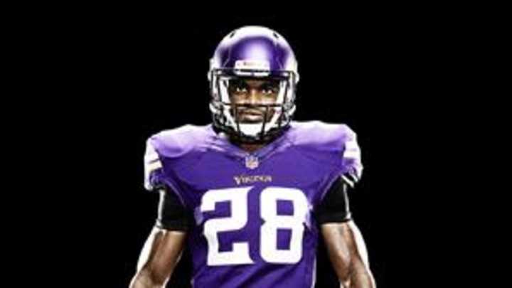
Minnesota Vikings unveil sleek new uniforms

Record-setting running back Adrian Peterson marvels when he thinks about other teams' uniforms. He also laments about the drab unis that the Vikings wore last year, but now he finally has something to brag about with Minnesota's new duds.
"The jersey we had last year was kind of a reach," Peterson tells SI.com after glimpsing the Viking's new 2013 design. "This feels more like an original Vikings look you would expect from the Minnesota Vikings."
But that doesn't mean Peterson isn't stoked about the new satin finish on the all-purple helmet. He even brought out his inner color-wheel, saying "that matte-tone look, that finish, I think that brings the dark purple out in the jerseys more."
And he's right.
Todd Van Horne, Nike's football creative director, says that while the purple of the helmet and the jersey appear brighter -- having seen them in person, I can attest they certainly look like a truer purple -- the hue remains the same as last season. It's the use of yellow and satin finishes that give it a distinct definition.
"The yellow is brighter and has more sheen to it and that combination makes the purple feel brighter," Van Horne says. Also, opting for no outlines on the white numerals provide an even more vibrant purple. For the helmets, the satin finish -- no more sparkles and glitter there -- was designed to mimic a traditional leather Viking helmet and enable the horns on the logo to stand out more. "That is the storytelling part, making the horns a more prominent part of the identity," Van Horne says.
The Vikings also updated their font and sleeve stripes, getting a bit more Viking-esque feel and harkening to the look of sails on an old ship. "The numbers have that more Viking-type look going for it," Peterson says.
Does this all matter to the players, though? "Yeah, definitely," Peterson says. "Guys are more interested in what they are going to be wearing. I sit back and say other teams have some pretty hot uniforms, but when I look at ours now I'm pretty comfortable. I'm satisfied with what Nike has designed."
Van Horne says that designers take the player's increased interest in the uniform to heart. For example, the inside back neck of the Vikings' look has detailed ornamentation designed to represent classic Viking armor. "It may be that just the player sees it, but we want them to get that embodied Viking spirit," he says.
When Nike took over the NFL's on-field and sideline gear contract in April 2012 the only team to carry out an aggressive redesign of its uniform was the Seattle Seahawks. Jacksonville revealed its new look on Tuesday, a complete overhaul from where it had been previously. Other teams received updated looks in 2012, mainly because the style of jersey Nike offered was different from Reebok, the previous supplier.
The jersey comes in three basic cuts, one for line players, one for skill players and another for quarterbacks. But each team has its own tailor and individualizes the fit from there. "All have nuances of shoulder length or sleeve openings or tightness of jersey," Van Horne says. "Then it gets to the individual athlete and their preferences."
Follow Tim Newcomb on Twitter at @tdnewcomb.
