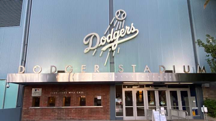
Dodgers Logo Gets Snubbed in Rankings

In this story:
The Los Angeles Dodgers logo hasn't changed much since it was first introduced in 1958. For that reason, it's one of the most recognizable sports logos in professional American sports.
That being said, the Dodgers logo, according to a recent survey, isn't even the most popular emblem in Major League Baseball. The survey, conducted by Quality Logo Products (QLP) Blog, ranked the Dodgers logo as the fourth-best in baseball. It finished behind the Yankees, Athletics, and Mariners.
Honestly, the fact that the Mariners got the top spot speaks volumes about the validity of this survey. To be fair, this writer hasn't seen the survey, but here's the criteria set forth by QLP.
"We posed the same question about Major League Baseball teams, surveying respondents about their thoughts concerning the best, worst, most/least creative, strongest/weakest, and easiest to understand/most confusing."
The Yankees being ranked ahead of the Dodgers is probably the least surprising thing about the survey. But, the Mariners and the Athletics ranked ahead of LA is...interesting.
