Red Sox Clear Up Culprit Behind Viral Uniform Debacle

In this story:
There's nothing like a viral uniform controversy to spice up the month of February in Major League Baseball.
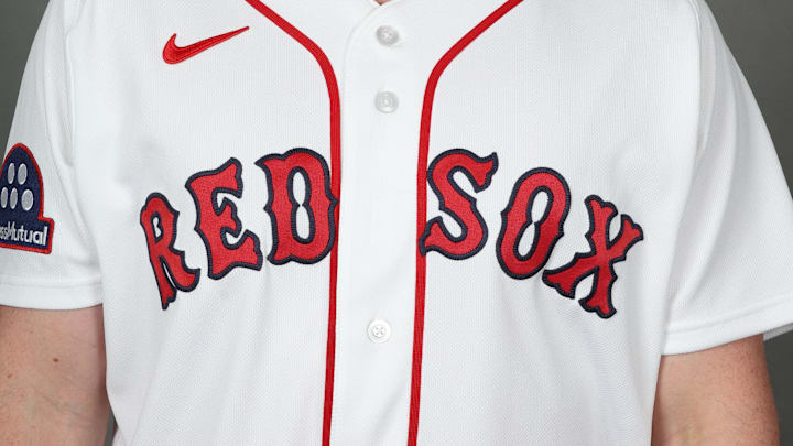
On Tuesday, during Boston Red Sox media day, fans quickly noticed that the script on the team's home white jerseys was touching the front piping. Side-by-sides made it clear that the piping had been widened since last season, and the lettering hadn't been adjusted to match.
Compared to last year (left), there’s something off about the lettering on the Red Sox’ home whites this year (right). pic.twitter.com/1whb3Vlyj8
— Brendan Campbell (@brendan_camp) February 17, 2026
Many were quick to accuse Fanatics, the well-known sports merchandise giant responsible for producing the league's uniforms, despite their Nike branding. But on Wednesday, the Red Sox set out to clear up who was actually to blame: themselves.
If you like our content, choose Sports Illustrated as a preferred source on Google.
Red Sox say they're at fault for uniform mishap
A statement regarding our 2026 uniforms: pic.twitter.com/x9VMZQlerJ
— Red Sox (@RedSox) February 18, 2026
In a statement posted to X, the Red Sox said Fanatics had made the jerseys "exactly to our specs," and said that after seeing how they looked after production, they would work in conjunction with the league and Fanatics to correct the spacing by opening day.
The league as a whole returned to the jersey template used until the end of the 2023 season, which was the fans' preference, by and large. The jerseys used in 2024 and 2025 had the MLB logo below the collar stitching instead of above it, and in the former season, the letters were often comically small.
A good look at the jersey font and lettering.
— Danny Vietti (@DannyVietti) February 25, 2025
LAST YEAR (2024) THIS YEAR (2025) pic.twitter.com/D6L482PEGx
So when Red Sox fans thought their team's uniforms would be the "best" they'd seen in a span of three seasons, one can understand why they quickly lashed out at their perceived culprit.
At the end of the day, all that should be affected are the Red Sox's team photos and hype video-type content, which could make for an interesting trivia question sometime down the road.
Also of note, the Red Sox have four other jerseys (gray, red, yellow City Connect, Green City Connect), and none of them have the same style of piping down the center. The red jerseys, in particular, are worth watching because they say "Red Sox" in the same font as the whites.
It will be interesting to see if the reds look noticeably different than the whites once the spacing is adjusted, or if it's adjusted for both.

Jackson Roberts is a former Division III All-Region DH who now writes and talks about sports for a living. A Bay Area native and a graduate of Swarthmore College and the Newhouse School at Syracuse University, Jackson makes his home in North Jersey. He grew up rooting for the Red Sox, Patriots, and Warriors, and he recently added the Devils to his sports fandom mosaic. For all business/marketing inquiries regarding Boston Red Sox On SI, please reach out to Scott Neville: scott@moreviewsmedia.com