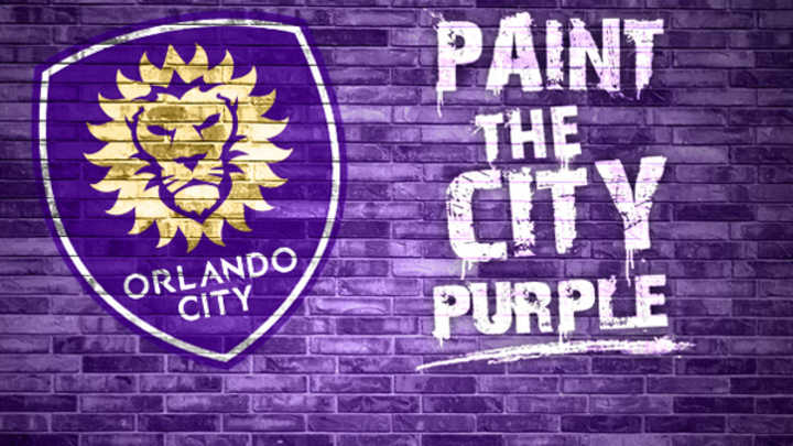
Orlando City unveils new franchise logo for 2015 MLS expansion season

Orlando City unveiled a new logo for its entrance into MLS next year. (Orlando City SC)
Orlando City is rebranding for its launch as a Major League Soccer franchise in 2015, starting on Tuesday with a new crest. The lion that was a major part of its USL PRO brand remains as the main feature of the new logo, as does the color purple.
The new franchise was required to change its logo and its brand upon becoming MLS's 21st franchise, according to the Orlando City press release. The logo and color pay homage to both the USL brand and the old Orlando Lions team that played in the American Soccer League and American Professional Soccer League from 1985 to 1996.
From Orlando City:
Remaining as the central focal point of the logo, is the Lion, indicating strength and pride. The King of the Jungle reflects Orlando City’s successful tenure in USL PRO and reluctance to shy away from an opponent.
The logo is also symbolic of a new beginning for Orlando City. The 21 sun flares bordering the Lion signifies the club being named MLS’ 21st franchise in November of 2014.
The sun is emblematic of a new goal for Orlando City. With Florida being widely known as the Sunshine State, the integration of the sun in the new logo describes OCSC’s aspiration to become the team that not only represents the City of Orlando but also the State of Florida.

Liviu Bird is a soccer analyst with more than 20 years of experience in the game. He learned how to play in the streets of Romania before moving to the soccer wilderness of Fairbanks, Alaska, escaping to play collegiately as a goalkeeper at Highline Community College and Seattle Pacific University, where he also earned his B.A. in journalism. Bird played semiprofessionally and had tryouts at professional clubs but hung up his gloves in 2012 to focus on writing and coaching at the youth and collegiate levels. He joined Sports Illustrated in March 2013 as a freelance contributor and has also written for NBC Sports, Soccer Wire, The New York Times, American Soccer Now and the Telegraph (UK).