Team Health Reports 2012 Primer

Baseball likes round numbers. Five-hundred homers. Batting .300. Ten-year anniversaries. The Team Health Reports hit one of those this year, with the 10th edition of the most accurate risk assessments in fantasy sports. It sounds like an advertising slogan to say "many imitators, no equals," but it's true.
For the uninitiated, what the Team Health Reports do is assign a risk value to each starting player on a roster. Those risks are banded together into three groups -- red, yellow, and green. The stoplight metaphor makes it very easy to grasp at a glance.
But a decade in, there is still some misunderstading about what the THRs and the underlying risk engine are intended to do. These aren't projections that intend to crystal ball the future. I'm no psychic. This is, at its heart, actuarial. Actuaries and their data power everything these days, from giant insurance companies to banks, but the THRs have been using this kind of data since 2003. It's the secret weapon used as the baseline for all the ratings.
Underneath each of the three "colors" or bands in each THR is an underlying rating. It's numerical, adjusted to a 0-101 scale. (Yes, the extra point is important.) The bands are designed to be both mathematically valid, following a standard bell curve, while also being very easy to read. (Even those of you whot are color blind can follow the format easily.) I've had several advisers look over numbers both from the past and from this season, especially when there were some confusing results this year. I'm convinced this is the best batch I've ever done.
The reason is the underlying changes. For a period of time, the System -- yes, it's capitalized -- was hamstrung a bit by the projections that overlay and adjust the baseline table. Last year, I made the switch to a more accurate projection system, Tom Tango's MARCEL. For 2012, I used a weighted amalgam of MARCEL and the new baseball projections from my friends at numberFire. MARCEL is a "dumb" projection system that is inherently conservative, while numberFire's projections are actually looking for the volatility that can make or break a fantasy season. Using both, layered atop actuarial data, is even better than either alone.
On top of all that are the 11 factors I've identified as predictive factors. Playing time adjustments, injury history, changing team contexts and more go into the calculations that the System churns through, which leads me to another change this year. In past years, the System was powered by a combination of two desktop programs and could only go as fast as my laptop. This iteration was powered by Amazon's Elastic Cloud Computing service, which allowed computing power I could have only dreamed about 10 years ago. Instead of hours, calculations took minutes, results could be checked in seconds and I could correct and improve almost on-the-fly.
All that happens so that we come up with risk profiles. These are probabilities, not certainties. Just as your insurer calculates rates based on the likelihood you'll get into a fender bender, the System is doing the same depending on the probability of a player getting into an accident in a baseball environment. Some have tried to outthink the System and predict injuries, even to specific body parts. That's pure folly, since a majority of baseball injuries are traumatic. If someone could predict arm injuries to pitchers, they'd be inside the game, touted as the great mind since Peter Brand. If someone could predict that Jacoby Ellsbury would lose a collision with Adrian Beltre, that Josh Hamilton would snap his humerus on a slide, or that Ryan Madson would lose a kicking contest with a cooler, they would be predicting more important things than baseball.
Now that you understand what's going on under the surface a bit, you're ready to read the 30 team write-ups. Those require a bit of explanation as well. These aren't simple skim-and-use reports that you can just glance at before a draft. Well, I guess you can, but you'll miss out. Remember, these are probabilities, not certainties. The expertise and insider knowledge that the THRs add are revealed in the write-ups. Sometimes we think we're smarter than the System. Sometimes we know things that the System doesn't have as an input or we can give you a nugget of truth that can help you decide how to best use the information as you're preparing for your baseball season.
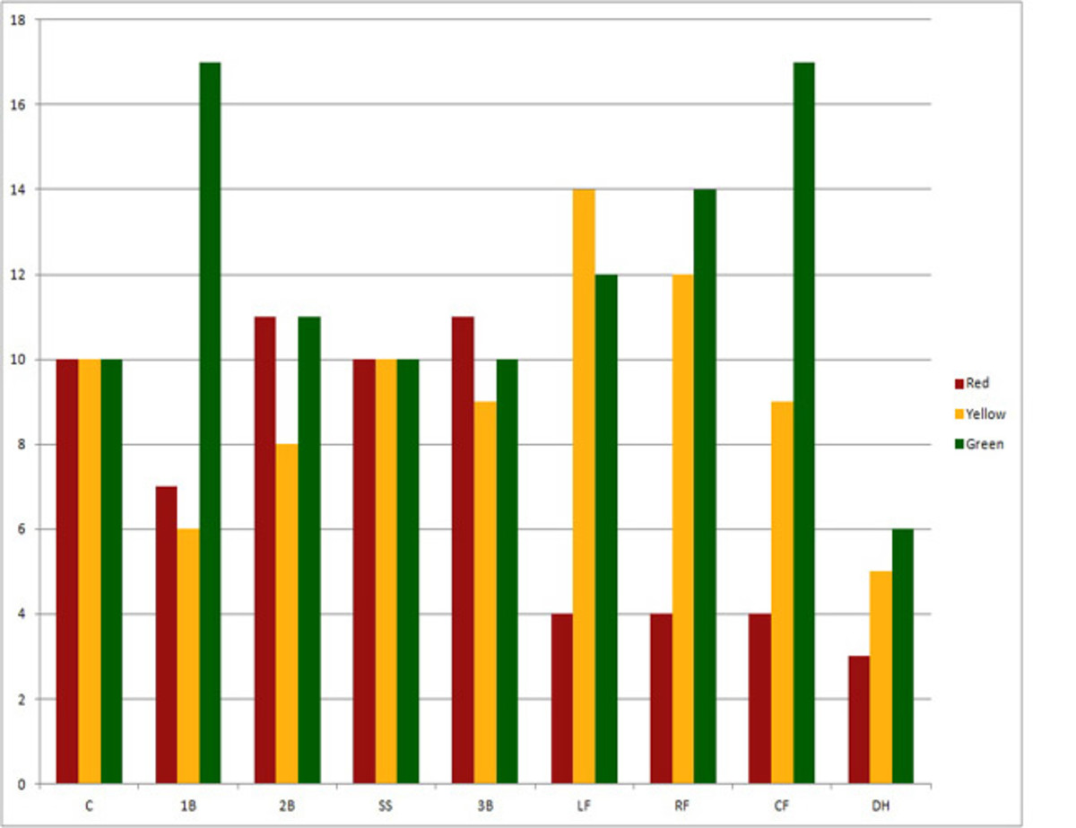
One of the quickest ways to note the risk profiles is to take a look at just how risky various positions are. The charts below are pretty clear.
While others talk of positional scarcity, few talk about risk-adjusted scarcity. This new concept is one I've been toying with, back-testing data to see if draft strategies or team construction techniques could be better if risk was considered and properly weighted. In a study done in 2010 and using my '09 Team Health Report data, it was clear that the risk bands (red/yellow/green) could be used to help measure risk, and therefore, playing time. I believe that risk-adjusted scarcity takes this a step beyond. There's no one-size-fits-all solution for this, but I believe you have to not only tier players, but risk-adjust those tiers. I'll be talking a lot more about this in the weeks leading up to the season, the heart of draft season.
For now, you have 30 team reports to read and a baseball season to look forward to. Good luck.
Special thanks to Dan Wade, Jeff Stotts and Aaron Miner for their invaluable assistance during this year's production of the Team Health Reports.