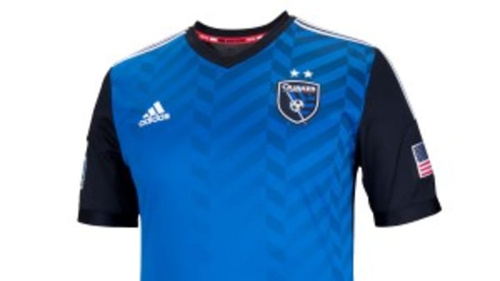
San Jose Earthquakes unveil new logo and jerseys

Chris Wondolowski & Co. will enter the 2014 MLS season with a brand-new look.
The San Jose Earthquakes unveiled their new logo and jerseys in front of more than 4,000 fans Thursday night at a ceremony at San Pedro Square Market in San Jose, ushering in a new era for the club. The fashion shift pays homage to San Jose's past -- the team's NASL days, when red was their primary color-- and present with the new threads.
While the club is still without a jersey sponsor (only San Jose, Colorado and Houston were without kit sponsor deals in 2013, and Volkswagen ended its sponsorship of D.C. United following the season), the jerseys do boast the club's new crest. On the secondary red jersey, a #NeverSayDie hashtag is inscribed on the back of the neck, a nod to the club's late-game heroics and Goonies identity.No word yet if Wondolowski will have an extra "W" inscribed inside his jersey like during the CONCACAF Gold Cup this summer.
The club's old logo has been replaced by a more modern edition -- and with just "Quakes," and not Earthquakes on the crest -- with the team providing a detailed explanation of all of the new elements. The actual logo unveil can be seen here:
“This is a momentous day for the San Jose Earthquakes as we continue to shape the identity of this club to match its rich history and community ties,” Earthquakes president Dave Kaval said in a team statement. “After consulting with fans, former players, staff and community stakeholders, we established three pillars for the club: Unity, Devotion, Heritage. Each of those pillars was integrated into the design of our new logo and will define the organization going forward.”
Kaval had spoken to SI.com's Brian Straus about the club's future at the MLS SuperDraft in Philadelphia a couple of weeks ago:

Avi Creditor is a senior editor and has covered soccer for more than a decade. He’s also a scrappy left back.