'This is the Spurs': Designer Details Process Behind the Iconic Logo

In this story:
The San Antonio Spurs have changed a lot over the years but the team's branding has remained remarkably enduring.
Since their arrival from Dallas to the Alamo City for American Basketball Association endeavors in 1973, the Spurs have lived up to their namesake. Though the original logo has been tweaked and updated, the team has refused to stray away from its most common aesthetic, which includes a spur in its primary emblem, one made to represent the "u" in the nickname. The logo stuck with the team upon their promotion to the National Basketball Association and has remained ever since in some way, shape, or form ever since.
KSAT, San Antonio's ABC affiliate, tracked down Finis Collins, the original designer of the timeless mark as the team prepares to celebrate its 50th season in River City. Showcasing a spur, Collins explained, was the mindset from the get-go as the team rebranded from its previous identity, the Dallas/Texas Chaparrals. He collaborated directly with the Spurs' newly-implanted ownership group, namely Red McCombs.
"The only thing that they wanted was some way to show the spur as part of the symbol," Collins, now 93, told RJ Marquez. "They said we would like to have a spur drawing somewhere.”
Collins drew a wordmark by hand to serve as the team emblem, placing the desired spur right in the middle in three-dimensional fashion. The city itself had no shortage of inspiration, as Collins visited the Witte Museum to get the look exactly right. His visits produced three designs, which took four days to complete.
"I just ran down to the Witte Museum, looked at all the hoof spurs they got on exhibit," Collins said as he proudly displays his original Spurs sketch.
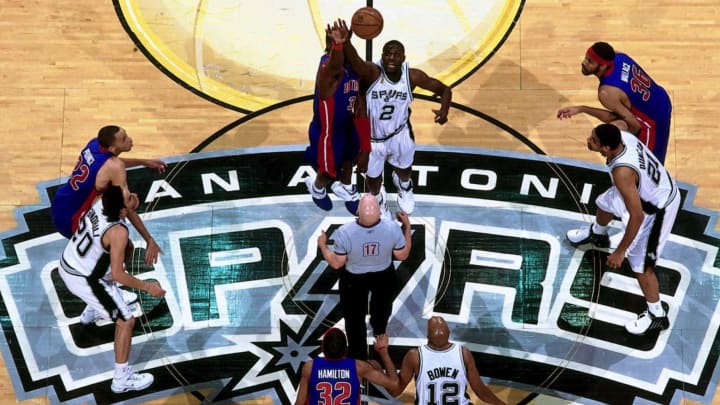
The Spurs aesthetic has undergone several changes but the "u", even with a few tweaks, has stuck around. The team has worn it as a secondary emblem since 2002 and it has also graced the team's center court at AT&T Center.
While many major corporate designs often take several attempts to completely land, Collins said that Spurs management approved his work the day after he submitted it.
"They didn't change anything," Collins recalled. "It takes, usually, a lot of grinding and a lot of work. But in this case, it just went flying through, bang, bang, bang."
Collins, whose work can also be seen by anyone who has stayed at a La Quinta Inns and Suites establishment, has thus become a vital, if not quiet, part of the storied franchise's lauded history. He, however, has remained humble with his muted part in the team archives.
"I don't want to take any credit at all from anybody else," he said. "Red McCombs, he named it. All I did was do a piece of artwork that said 'this is the Spurs.'"
