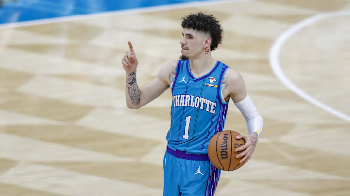
Ranking the top five Hornets alternate jerseys of the last decade

In this story:
When it comes to grading the Charlotte Hornets' alternate uniforms over the past decade, it's impossible to ignore the timeless beauty of Charlotte's throwback pinstriped uniforms based on the original 1988 design.
That being said, the Hornets have rolled out a couple of clean, modern alternates that also made their way onto this list.
Top five Hornets alternate jerseys of the last decade
5. 2018-19 City Edition
The 2018-19 City Edition uniform was a superior sequel to the 2017-18 City Edition, and it is arguably the freshest "Buzz City" jersey the franchise has ever released.
The Charlotte Hornets today unveiled the City Edition uniform to be worn during the 2018-19 season. The Hornets are scheduled to wear the uniform for the first time on Monday, November 19, when they host the Boston Celtics. pic.twitter.com/iFT2QHO1lK
— GD (@sarafinasaid) November 1, 2018
By removing all white from the uniform design, Jordan Brand arrived at a sleek, simple, and understated jersey that stood out among other City Editions across the NBA that season.

This is also the best black jersey the Hornets have ever made. The teal font and trim really pops, and the gray pattern on the sides of the jersey resembles the wings of a hornet in a way that isn't obnoxious or outlandish.
This uniform is classy and cool, and it's clear that the designers understood the value of not overthinking or overcomplicating the aesthetic.
4. 2019-20 City Edition
The 2019-20 City Edition uniform was a groundbreaking release for the Hornets in two ways. This was the first (and so far, the only) gray uniform in team history. Alongside the Statement Edition uniform from that season, it also marked the first time a Hornets uniform employed the "CHA" chest plate.
#Hornets new city edition jerseys -Thoughts? pic.twitter.com/Shk3RqxBgM
— CharlotteVibe (@charlottevibe) November 22, 2019
The Hornets referred to the color of this uniform as "cool gray", and that was an apt description. The hue was quite pleasing, and the teal and purple trim around the collar and sleeves was tasteful.

The "cell" pattern on the side of the uniform could have been less synthetic-looking, but the logo further down on the shorts was a great touch. Choosing to make the numbers white was the final stroke of genius for this uniform.
3. 2019-20 Classic
The Hornets franchise was founded in 1988, but the iconic purple uniform didn't arrive until 1994. The 2019-20 Classic uniform was an obvious homage to that jersey, and it didn't miss the mark.
The purple classic uniform is BACK! 👀🐝 pic.twitter.com/fvibFw0Be7
— Charlotte Hornets (@hornets) August 20, 2019
Imitation is the sincerest form of flattery, which is why Jordan Brand was smart to release a nearly identical uniform to the 1994 version.

It's tough to pull off purple as a professional sports team, but these Hornets uniforms do as well as anything else, the Sacramento Kings included. What ties everything together are the multi-color pinstripes accentuating the uniform top, a design which also features in the two other classic Hornets masterpieces.
2. 2023-24 Classic
The 2023-24 Classic uniform is a brilliant design because it combines elements of the original 1988-89 away uniform and the 1997-98 away uniform, and it is arguably a more attractive jersey than both.
Purple, teal & pinstripes. 🔥
— Charlotte Hornets (@hornets) October 4, 2023
Available NOW in-store at @hornetsfanshop and online at https://t.co/oVpneObjna pic.twitter.com/n2sZipTHDt
The Hornets paid direct homage to the 1988-89 uniform with the 2017-18 Classic uniform, but the 2023-24 Classic incorporates the purple collar and sides that worked so well with the 1997-98 version.

You rarely see a team revamp an old uniform and outdo the original, but this might be the best-looking teal jersey the Hornets have ever put on an NBA court.
1. 2018-19 Classic
Speaking of Hornets pinstripes, nowhere do they pop more than on the white surface of the 2018-19 Classic uniform, which, of course, is a direct reference to the franchise's original home jerseys.
The Hornets new classic jerseys are straight 🔥 pic.twitter.com/qL761QYifA
— Prime Time Sports Talk (@TalkPrimeTime) July 25, 2018
Besides being easy on the eyes, the 2018-19 Classic (a mirror image of the original model) remains one of the boldest and most unique uniform designs in league history.

When you think of the Charlotte Hornets brand, you immediately think of teal and pinstripes. However, the beauty of the original white uniform design (away jersey) is that it incorporates those two elements in a more nuanced color scheme than the home design, creating a jersey that is all at once adventurous, fashionable, and elegant.
- MORE STORES FROM HORNETS ON SI -
Jeff Peterson was crushed on lottery night, but Kon Knueppel changed the mood fast
Why 2025-26 is not a make-or-break year for LaMelo Ball in Charlotte despite all the noise
Jeff Peterson let Steve Clifford call in the Hornets' No. 4 pick
Chris Jent leaving Hornets to join Knicks as associate head coach

Colin Keane is a contributing journalist for "UConn Huskies On SI." Born in Illinois, Colin grew up in Massachusetts as the third of four brothers. For his high school education, Colin attended St. Mark's School (Southborough, MA), where he played basketball and soccer and served as student body president. He went on to receive a Bachelor of Arts in English Literature from Villanova University. Colin currently resides in Williamsburg, Brooklyn. For all business/marketing inquiries regarding "UConn Huskies On SI," please reach out to Scott Neville: scott@wtfsports.org