%22%3E%0A%3Cpath%20d%3D%22M0%207.21509H12.9429C16.1457%207.21509%2018.1615%207.94042%2019.5086%209.29688C20.3375%2010.1258%2020.931%2011.3127%2020.931%2012.8953V12.9612C20.931%2015.7024%2019.2825%2017.3886%2016.8051%2018.2458C19.7723%2019.103%2021.694%2020.6855%2021.694%2023.86V23.9259C21.694%2027.628%2018.6608%2030.3315%2012.811%2030.3315H0V7.21509ZM13.3385%2014.6474C13.3385%2013.6206%2012.5096%2013.0648%2010.8611%2013.0648H7.52648V16.2959H10.8894C12.5379%2016.2959%2013.3291%2015.7307%2013.3291%2014.7133V14.6474H13.3385ZM11.4263%2021.0529H7.52648V24.4817H11.3886C13.0748%2024.4817%2013.932%2023.7941%2013.932%2022.7956V22.7296C13.932%2021.7405%2013.103%2021.0435%2011.4263%2021.0435V21.0529Z%22%20fill%3D%22white%22%2F%3E%0A%3Cpath%20d%3D%22M23.1826%2024.1899V12.302H30.6808V21.7784C30.6808%2023.3327%2031.604%2024.2181%2032.725%2024.2181C33.8459%2024.2181%2034.8727%2023.3233%2034.8727%2021.7784V12.302H42.3615V30.3316H34.8727V27.9202C33.714%2029.4085%2031.9054%2030.7555%2029.3621%2030.7555C25.5658%2030.7555%2023.192%2028.2499%2023.192%2024.1899H23.1826Z%22%20fill%3D%22white%22%2F%3E%0A%3Cpath%20d%3D%22M46.1296%2018.0763H44.0195V12.3019H46.1296C46.1673%2010.3897%2046.6288%208.83538%2047.7498%207.71442C48.9744%206.48983%2050.5569%206%2053.0344%206C55.248%206%2056.5951%206.19782%2057.6218%206.49925V11.1904C56.8965%2011.0208%2056.1712%2010.9266%2055.2103%2010.9266C54.0517%2010.9266%2053.4582%2011.3882%2053.4582%2012.3773V12.5091H57.6218V18.0857H53.6278V30.3315H46.139V18.0857L46.1296%2018.0763ZM60.1935%2018.0763H58.0834V12.4997H60.1935C60.1935%2010.4839%2060.655%208.86364%2061.8137%207.71442C63.0383%206.48983%2064.6208%206%2067.0982%206C69.3119%206%2070.6589%206.19782%2071.6857%206.49925V11.1904C70.9604%2011.0208%2070.235%2010.9266%2069.2742%2010.9266C68.1156%2010.9266%2067.5221%2011.3882%2067.5221%2012.3773V12.5091H71.6857V18.0857H67.6917V30.3315H60.2029V18.0857L60.1935%2018.0763Z%22%20fill%3D%22white%22%2F%3E%0A%3Cpath%20d%3D%22M71.8174%2025.2072V25.1412C71.8174%2021.5428%2074.4926%2019.527%2078.6845%2019.527C80.2011%2019.527%2082.151%2019.8567%2082.9423%2020.1864V19.8849C82.9423%2018.2364%2081.9155%2017.2756%2079.6076%2017.2756C77.7613%2017.2756%2076.207%2017.6713%2074.6245%2018.3024L73.3057%2013.3193C75.3875%2012.528%2077.7613%2012.0005%2080.8981%2012.0005C84.5625%2012.0005%2086.9363%2012.7635%2088.5282%2014.346C89.8847%2015.7025%2090.4122%2017.4452%2090.4122%2020.0545V30.3221H82.9234V28.5041C81.6706%2029.8606%2079.9844%2030.746%2077.7425%2030.746C74.276%2030.746%2071.8362%2028.7679%2071.8362%2025.1977L71.8174%2025.2072ZM83.0082%2023.6623V22.8993C82.5749%2022.7297%2081.9155%2022.5978%2081.2938%2022.5978C79.8054%2022.5978%2078.9859%2023.4927%2078.9859%2024.6137V24.6796C78.9859%2025.7347%2079.7489%2026.4317%2080.7003%2026.4317C82.0191%2026.4317%2083.0082%2025.3767%2083.0082%2023.6623Z%22%20fill%3D%22white%22%2F%3E%0A%3Cpath%20d%3D%22M92.71%206.22607H100.208V30.3221H92.71V6.22607Z%22%20fill%3D%22white%22%2F%3E%0A%3Cpath%20d%3D%22M102.093%2021.3826V21.3166C102.093%2016.2299%20106.322%2011.8779%20112.257%2011.8779C118.191%2011.8779%20122.355%2016.1734%20122.355%2021.2507V21.3166C122.355%2026.4034%20118.125%2030.7554%20112.191%2030.7554C106.256%2030.7554%20102.093%2026.4599%20102.093%2021.3826ZM115.158%2021.3826V21.3166C115.158%2019.5363%20113.839%2018.1139%20112.181%2018.1139C110.524%2018.1139%20109.28%2019.5363%20109.28%2021.2507V21.3166C109.28%2023.097%20110.599%2024.5194%20112.247%2024.5194C113.896%2024.5194%20115.149%2023.097%20115.149%2021.3826H115.158Z%22%20fill%3D%22white%22%2F%3E%0A%3Cpath%20d%3D%22M132.896%207.21509H145.838C149.041%207.21509%20151.057%207.94042%20152.404%209.29688C153.233%2010.1258%20153.826%2011.3127%20153.826%2012.8953V12.9612C153.826%2015.7024%20152.178%2017.3886%20149.701%2018.2458C152.668%2019.103%20154.589%2020.6855%20154.589%2023.86V23.9259C154.589%2027.628%20151.556%2030.3315%20145.707%2030.3315H132.896V7.21509ZM146.234%2014.6474C146.234%2013.6206%20145.405%2013.0648%20143.757%2013.0648H140.422V16.2959H143.785C145.433%2016.2959%20146.225%2015.7307%20146.225%2014.7133V14.6474H146.234ZM144.312%2021.0529H140.413V24.4817H144.275C145.961%2024.4817%20146.818%2023.7941%20146.818%2022.7956V22.7296C146.818%2021.7405%20145.989%2021.0435%20144.312%2021.0435V21.0529Z%22%20fill%3D%22white%22%2F%3E%0A%3Cpath%20d%3D%22M156.135%206.22607H163.897V11.0114H156.135V6.22607ZM156.267%2012.3019H163.765V30.3315H156.267V12.3019Z%22%20fill%3D%22white%22%2F%3E%0A%3Cpath%20d%3D%22M166.271%206.22607H173.769V30.3221H166.271V6.22607Z%22%20fill%3D%22white%22%2F%3E%0A%3Cpath%20d%3D%22M176.274%206.22607H183.773V30.3221H176.274V6.22607Z%22%20fill%3D%22white%22%2F%3E%0A%3Cpath%20d%3D%22M184.922%2028.1461L187.465%2023.8883C189.641%2025.2447%20192.09%2025.9041%20194.135%2025.9041C194.86%2025.9041%20195.227%2025.7346%20195.227%2025.3107V25.2447C195.227%2024.8774%20194.898%2024.6513%20193.079%2024.1897C188.52%2023.0687%20185.713%2021.8442%20185.713%2018.1139V18.0479C185.713%2014.0822%20188.878%2011.8779%20193.569%2011.8779C196.537%2011.8779%20199.476%2012.6409%20201.661%2013.9597L199.287%2018.4153C197.375%2017.3603%20195.058%2016.7292%20193.541%2016.7292C192.816%2016.7292%20192.486%2016.927%20192.486%2017.2944V17.3603C192.486%2017.7183%20192.882%2017.9538%20194.7%2018.4153C199.259%2019.5363%20202%2020.7891%20202%2024.4911V24.5571C202%2028.4852%20199.061%2030.7648%20194.172%2030.7648C190.677%2030.7648%20187.503%2029.8699%20184.931%2028.1555L184.922%2028.1461Z%22%20fill%3D%22white%22%2F%3E%0A%3Cpath%20fill-rule%3D%22evenodd%22%20clip-rule%3D%22evenodd%22%20d%3D%22M211.368%204.36764C217.191%20-1.45588%20226.632%20-1.45588%20232.456%204.36764C238.279%2010.1912%20238.279%2019.6324%20232.456%2025.4559L221.912%2036L211.368%2025.4559C205.544%2019.6324%20205.544%2010.1912%20211.368%204.36764ZM214.009%207.55761C213.948%207.86849%20213.916%208.39718%20213.916%209.14566V10.4189C213.916%2011.1832%20213.948%2011.7198%20214.013%2012.0267C214.078%2012.3317%20214.278%2012.6168%20214.617%2012.8762C214.956%2013.1376%20215.403%2013.3316%20215.958%2013.4623C216.512%2013.593%20217.1%2013.6584%20217.837%2013.6584C218.573%2013.6584%20219.217%2013.591%20219.769%2013.4524C220.322%2013.3158%20220.761%2013.1178%20221.086%2012.8604C221.411%2012.6029%20221.605%2012.3178%20221.666%2012.0069C221.728%2011.6961%20221.759%2011.1674%20221.759%2010.4189V9.14566C221.759%208.38134%20221.728%207.84473%20221.662%207.53781C221.597%207.23287%20221.397%206.94971%20221.058%206.68834C220.72%206.42696%20220.272%206.23291%20219.718%206.10223C219.163%205.97154%20218.536%205.90619%20217.839%205.90619C217.102%205.90619%20216.459%205.97352%20215.906%206.11213C215.352%206.24875%20214.914%206.44677%20214.589%206.70418C214.265%206.9616%20214.071%207.24673%20214.009%207.55761ZM219.276%2024.8638C222.876%2024.8638%20224.557%2024.2064%20224.557%2021.862V21.858V21.3155C224.557%2019.6581%20223.516%2018.971%20220.252%2018.3136C219.278%2018.1136%20218.908%2017.9136%20218.908%2017.3136V16.9414C218.908%2016.6543%20219.177%2016.5117%20219.413%2016.5117C219.749%2016.5117%20219.918%2016.7137%20219.918%2016.9414V18.1136H224.391V17.3988C224.391%2015.4563%20223.347%2014.4266%20219.177%2014.4266C216.15%2014.4266%20213.896%2015.3414%20213.896%2017.3711V17.7433C213.896%2019.5155%20214.805%2020.3155%20218.201%2021.0303C218.28%2021.0472%20218.355%2021.063%20218.427%2021.0781C219.329%2021.2674%20219.647%2021.3341%20219.647%2021.9174V22.2897C219.647%2022.6619%20219.546%2022.8045%20219.142%2022.8045C218.67%2022.8045%20218.637%2022.5471%20218.637%2022.262V21.2897H213.894V21.7471C213.894%2024.149%20215.476%2024.8638%20219.276%2024.8638ZM225.424%2024.5569H229.925V14.7355H225.424V24.5569ZM226.955%2013.5019H229.925V6.06064H227.092V9.411L225.193%206.06064H222.359V13.5019H225.193V10.1199L226.955%2013.5019ZM218.269%2012.152C218.204%2012.2688%20218.055%2012.3262%20217.825%2012.3262L217.827%2012.3282C217.604%2012.3282%20217.459%2012.2767%20217.398%2012.1758C217.336%2012.0748%20217.305%2011.8074%20217.305%2011.3758V7.90068C217.305%207.51852%20217.352%207.28684%20217.445%207.20962C217.538%207.13239%20217.675%207.09279%20217.851%207.09279C218.059%207.09279%20218.198%207.14031%20218.265%207.23734C218.332%207.33239%20218.366%207.55416%20218.366%207.90068V11.3203C218.366%2011.7579%20218.334%2012.0352%20218.269%2012.152Z%22%20fill%3D%22white%22%2F%3E%0A%3C%2Fg%3E%0A%3Cdefs%3E%0A%3CclipPath%20id%3D%22clip0_15232_2523%22%3E%0A%3Crect%20width%3D%22237%22%20height%3D%2236%22%20fill%3D%22white%22%2F%3E%0A%3C%2FclipPath%3E%0A%3C%2Fdefs%3E%0A%3C%2Fsvg%3E%0A)
Ranking Bills' Nickel City Look Among NFL's Grey Uniforms
In this story:
For better or worse, the Buffalo Bills are rolling out a new alternate uniform combo this season. And it's safe to say it's one of the more unique looks in NFL history.
Grey has often been a complimentary color for teams over the years, from the Dallas Cowboys and New York Giants to the Philadelphia Eagles and Las Vegas Raiders.
But what about the teams that have gone with the grey look? How do the Bills' new digs live up to those previous jerseys?
Here's where they stack and why Buffalo going with this "Nickel City" look is one that's causing such a stir.
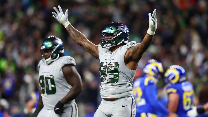
1) Seattle Seahawks

The Seahawks top this list because they killed this look twice. As part of a 2012 Nike rebrand, Seattle debuted its wolf grey alternate, ironically, against the Bills on December 16.
The all-grey look was one of the cleanest alternates in the NFL. Not only did it align with one of Nike's best rebrands of the 2010s, but it was also a nice way to highlight one of the team's secondary colors that was already a part of its color scheme.
The 'Hawks would get another all-grey set last season, too, as Nike rolled out its "rivalry series" unis. This updated version of the grey was not too far removed from the original look, just adding feathers to the shoulder area, which matched the iridescent pattern on the numbers as well.
Two great grey looks, well done, Seattle. And, to add to it, the Seahawks won their two Super Bowls in seasons they wore these unis. Not too shabby.
2) Detroit Lions

Worn from 2017 to 2023, the Lions brought out a grey look that was accentuated by a blue helmet and the team's throwback logo from the 1950s. This look is most comparable to the Buffalo "Nickel City" look, but has a couple of things separating it.
First off, grey is Detroit's secondary color. So, the look is more authentic to the Lions than the "Nickel City" unis are to the Bills. Also, it's always cool to see a modern take on a throwback with the incorporation of the logo from the Bobby Layne era.
Detroit also became an NFL darling in these sets, with the Dan Campbell era beginning in 2021. So, that gives this look a little more oomph, rather than just the aesthetics being pleasing.
3) Buffalo Bills

What may be the most disappointing note about Buffalo going with this look is it passed up the opportunity to fully incorporate the red helmet set that was brought out for the finale at the old Highmark Stadium last season.
But keeping it strictly about the "Nickel City" look, it's a bit underwhelming on several fronts. Again, it was always going to disappointing if the red helmets were not fully reinstated. But the blue Charging Buffalo look is a little too immersive.
Unlike the Vikings' horns on their helmets or the Eagles' wings on their helmets, this new look is a lot less natural.
Bills unveil new alternate "Nickel City" uniforms 🔥
— NFL on ESPN (@ESPNNFL) July 27, 2026
Thoughts on the Buffalo Bills new jerseys? 😯
(📸: @BuffaloBills) pic.twitter.com/JIe8dSxQde
Now, the unis themselves, are not bad. It's a simple approach for a look that is, of course, inspired by one of the City of Buffalo's nicknames. And although very uplifting to honor the city this way, the simplicity of the set adds to it coming up short.
In the NBA, the Timberwolves have done a Prince-inspired City Edition jersey. In the MLB, the Padres have donned a jersey celebrating San Diego's Hispanic ties and Día de los Muertos.
But those looks really captured their cities. It's safe to say Bills fans are not necessarily feeling the same way at the moment.
Resilient. Gritty. Blue Collar.#BillsMafia | https://t.co/dSv2Kf4qfF pic.twitter.com/sSEbyEEyPt
— Buffalo Bills (@BuffaloBills) July 27, 2026
— Sign up for OnSI’s Free Buffalo Bills Newsletter —
 Add us as a preferred source on Google
Khari Demos is an award-winning sports media creator and is a contributor for Bills On SI. He has written sports betting article covering the NFL for The Athletic and has written pieces about the NBA, MLB, college football and basketball, and more, throughout his career.