%20%20--%3E%0A%3Csvg%20version%3D%221.1%22%20id%3D%22Layer_1%22%20xmlns%3D%22http%3A%2F%2Fwww.w3.org%2F2000%2Fsvg%22%20xmlns%3Axlink%3D%22http%3A%2F%2Fwww.w3.org%2F1999%2Fxlink%22%20x%3D%220px%22%20y%3D%220px%22%0A%09%20width%3D%2239px%22%20height%3D%2240px%22%20viewBox%3D%220%200%2039%2040%22%20enable-background%3D%22new%200%200%2039%2040%22%20xml%3Aspace%3D%22preserve%22%3E%0A%3Cpath%20fill%3D%22%23FFFFFF%22%20d%3D%22M38.5%2C7H28.2v26h10.3V7z%22%2F%3E%0A%3Cpath%20fill-rule%3D%22evenodd%22%20clip-rule%3D%22evenodd%22%20fill%3D%22%23FFFFFF%22%20d%3D%22M26.1%2C25.5c0%2C5.8-4.1%2C7.5-12.9%2C7.5C3.9%2C33%2C0%2C31.2%2C0%2C25.2v-1.1h11.6%0A%09v2.4c0%2C0.7%2C0.1%2C1.4%2C1.2%2C1.4c1%2C0%2C1.2-0.4%2C1.2-1.3v-0.9c0-1.6-0.9-1.6-3.5-2.2C2.2%2C21.7%2C0%2C19.7%2C0%2C15.3v-0.9C0%2C9.3%2C5.5%2C7%2C12.9%2C7%0A%09c10.2%2C0%2C12.8%2C2.6%2C12.8%2C7.4v1.8h-11v-2.9c0-0.6-0.4-1.1-1.2-1.1c-0.6%2C0-1.2%2C0.4-1.2%2C1.1v0.9c0%2C1.5%2C0.9%2C2%2C3.3%2C2.5%0A%09c8%2C1.6%2C10.5%2C3.3%2C10.5%2C7.5V25.5z%22%2F%3E%0A%3C%2Fsvg%3E%0A)
Man Utd’s Best and Worst Alternate Jerseys After 2026–27 Beauty
Manchester United’s jerseys have often matched their remarkable on-field success over the past four decades, especially when it comes to their away and third kits.
Some staggering designs have been drawn up by a combination of adidas, Umbro and Nike, with their 2026–27 third shirt another in a long list of classic attire.

However, with a healthy serving of stunners naturally comes the odd misstep—eyesores more befitting Ruben Amorim’s United than Sir Alex Ferguson’s.
With that in mind, here are the club’s best and worst alternate kits.
Best of Man Utd’s Alternate Kits
1990–92 Away

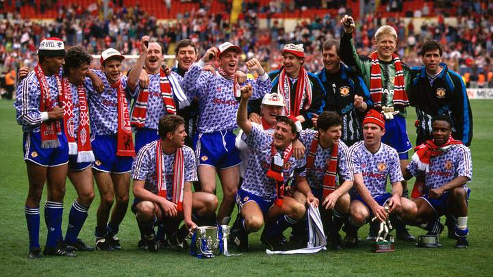
Few soccer kits have earned quite the renown of United’s fabled ‘snowflake’ number of the 1990–92 seasons. Despite their synonymity with red, the club have regularly opted for a contrasting blue changed strip, with none able to usurp one of their earliest iterations.
The retro adidas Trefoil. The burning red Sharp sponsor and old-school club crest. The gorgeous repeated motif running from top to bottom of the jersey.
What’s not to love?
1992–94 Third

Before United were, well United, they were ‘Newton Heath’. And before they donned their now iconic red, they wore green and gold.
The 1992–94 third jersey paid homage to those historic colors with a half-and-half design in partnership with Umbro. The green and gold combo has taken on a life of its own ever since, even being used as a fierce protest to the ownership of the Glazers in scarf form.
Nostalgia undoubtedly plays its part in looking back at vintage kits through rose-tinted spectacles, and this ’90s classic—enhanced by a retro shoelace collar—is inextricably linked with the glory days of the Premier League’s inception.
1994–96 Third

Umbro produced hit after hit for United before the turn of the century, even designing their own blue and white beauty shortly after adidas’s creation had wowed supporters.
Umbro opted for a deeper blue with their jersey, and partnered it with some white stripes and the gorgeous United crest inside a black shield. The stripes even extended into the shorts, which was a classy touch.
Simply breathtaking.
2003–05 Third

Nike took control of United’s jerseys in 2002 and conjured some corkers, even if they were generally less experimental than those produced during the 1990s by adidas and Umbro.
However, their crisp white third shirt used between 2003–05 was a particularly fine design.
The famous Vodafone sponsor was splashed across the midriff on top of horizontal black and red pinstripes, further accentuated by a chunky collar with black piping.
2009–10 Away

Sometimes, less is more.
Another gorgeous Nike jersey stole the show in the late noughties as United selected a prominent chevron design across the chest of their home and away jerseys for the 2009–10 campaign.
The red and black home shirt perfectly contrasted the black and blue away jersey, both of which were clean kits with a sprinkling of flair.
It’s not groundbreaking, but it’s still delightful.
2024–25 Away

The Red Devils reunited with adidas in 2016 and while they’re yet to reach the heights of their previous partnership, the 2024–25 away jersey was certainly a step in the right direction after some uninspiring predecessors.
A rich navy blue shirt was brought to life by a repeating ‘M’ motif, inspired by three Manchester rivers—the Irk, Medlock and Irwell.
However, what really elevates this one is the silver detailing. The badge, sponsor and sleeve stripes really pop.
Worst of Man Utd’s Alternate Kits
1995–96 Away

After being 3–0 down to Southampton at halftime while donning this grey monstrosity, Ferguson famously ordered his players to change into the aforementioned 1994–96 third jersey. He claimed his players were struggling to see one another on the field, and in fairness, United proceeded to win the second half—even if they still lost 3–1.
It was the fifth and final time the Red Devils wore the shirt having failed to win any match in it.
Regardless of visibility issues, United were justified in dropping this disastrous kit shortly before their Premier League title triumph. It’s hardly fitting attire for the champions.
2013–14 Away

On the field, United endured a dismal 2013–14 following the retirement of Ferguson and hiring of David Moyes, and their away jersey for the campaign reflected their lackluster performances.
A navy blue tartan pattern was never likely to fly off the shelves and did little to aid the Scotsman on the touchline.
The golden Premier League badges on the sleeves was about the only redeeming feature.
2020–21 Third

Widely known as United’s ‘zebra kit’, this has to be not only one of the club’s worst ever creations, but one of the ugliest jerseys in Premier League history.
An asymmetric black and white diagonal stripe pattern was never likely to dazzle, with bright red accents and the gold of the Chevrolet sponsor further muddling a confused mess.
It’s likely this kit will gain a cult following in the years to come, filed under the category of ‘it’s so bad, it’s good’.
2023–24 Away

United’s 2023–24 away kit supposedly “draws inspiration from the club’s early away strips, introducing a fresh interpretation of the classic green colour. Maroon-red lines punctuate white blocks, reminiscent of the city’s distinctive red bricks and architecture.”
If you ignore the marketing talk for one minute, it’s clear this kit is utterly repulsive.
The reinterpretation of the green simply doesn’t work, nor do the thick white stripes and Team Viewer sponsor. This one is best forgotten.
 Add us as a preferred source on Google
Ewan Ross-Murray is a soccer writer for SI FC. He boasts years of experience following his First Class Honours in Journalism from the University of Leicester, producing a variety of content from match reports and news pieces to more extensive features on an array of topics. With Scottish, Welsh and English heritage, Ross-Murray’s soccer influences are far-ranging, but his primary focus is on the Premier League and Champions League.