%20%20--%3E%0A%3Csvg%20version%3D%221.1%22%20id%3D%22Layer_1%22%20xmlns%3D%22http%3A%2F%2Fwww.w3.org%2F2000%2Fsvg%22%20xmlns%3Axlink%3D%22http%3A%2F%2Fwww.w3.org%2F1999%2Fxlink%22%20x%3D%220px%22%20y%3D%220px%22%0A%09%20width%3D%2239px%22%20height%3D%2240px%22%20viewBox%3D%220%200%2039%2040%22%20enable-background%3D%22new%200%200%2039%2040%22%20xml%3Aspace%3D%22preserve%22%3E%0A%3Cpath%20fill%3D%22%23FFFFFF%22%20d%3D%22M38.5%2C7H28.2v26h10.3V7z%22%2F%3E%0A%3Cpath%20fill-rule%3D%22evenodd%22%20clip-rule%3D%22evenodd%22%20fill%3D%22%23FFFFFF%22%20d%3D%22M26.1%2C25.5c0%2C5.8-4.1%2C7.5-12.9%2C7.5C3.9%2C33%2C0%2C31.2%2C0%2C25.2v-1.1h11.6%0A%09v2.4c0%2C0.7%2C0.1%2C1.4%2C1.2%2C1.4c1%2C0%2C1.2-0.4%2C1.2-1.3v-0.9c0-1.6-0.9-1.6-3.5-2.2C2.2%2C21.7%2C0%2C19.7%2C0%2C15.3v-0.9C0%2C9.3%2C5.5%2C7%2C12.9%2C7%0A%09c10.2%2C0%2C12.8%2C2.6%2C12.8%2C7.4v1.8h-11v-2.9c0-0.6-0.4-1.1-1.2-1.1c-0.6%2C0-1.2%2C0.4-1.2%2C1.1v0.9c0%2C1.5%2C0.9%2C2%2C3.3%2C2.5%0A%09c8%2C1.6%2C10.5%2C3.3%2C10.5%2C7.5V25.5z%22%2F%3E%0A%3C%2Fsvg%3E%0A)
NBA Cup Court Tiers: Ranking the Best and Worst Floors in 2026–27
In this story:
On Friday, the 2026 NBA Cup will commence. Also with the arrival of the NBA Cup come new courts for everyone to critique.
In an effort to visually differentiate NBA Cup group stage games from normal regular season games, every team has designed and installed a new court that is ... usually quite different from the standard hardwood we’re accustomed to seeing in the NBA. They are usually bold, if anything, and can sometimes teeter into “too much” territory. We will never forget the Timberwolves’ highlighter lime-green court from 2025.
With NBA Cup play getting underway Friday night, this year’s courts will debut across the league. In honor of the occasion, as the esteemed Tyler Lauletta did for Sports Illustrated last season, we ranked all the NBA Cup courts based on how appealing (or otherwise) they are to the eye. These won’t be traditional 30-1 rankings but instead a ranking broken down into five tiers, from the garish to the gorgeous.
NEXT: NBA Cup 2026 Explained: New Rules, Format Changes and How the Tournament Works
What’s the NBA Cup without some fun rankings, as I always say!
Tier 5: King Neptune’s bald head
These courts will hurt to watch on television.
Atlanta Hawks

There is just... a lot going on here, from the red court to the highlight yellow border to the black lettering screaming “HAWKS” on the baseline. There is no safe zone for your eyes to settle. Just very loud colors across the board.
Chicago Bulls

I desperately want to get behind a true red court but I can’t bring myself to do it. I’d consider it an improvement over last year’s bland design, but the dark red of the bull clashing against the lighter red of the court is an odd choice, as well as the white lettering on the baseline. But, again, the problem lies in that it’s impossible to offer an enjoyable viewing experience with a bright red court.
Denver Nuggets

Despite what you might think, this is not the Cavaliers’ court, which is the first problem. The second is that the yellow chosen appears to be of a brighter variety than the logo yellow and clashes much harder with the wine red than the deep blue. This could play better on the broadcast compared to this still image, but based on what we see right now it’s an unnecessarily harsh contrast.
Houston Rockets

See above re: red courts. And I think the funky logo is going to stand out in a bad way. The Rockets’ logo is a tough one to incorporate on a red court with the Cup in the background, but the guitar pick shape is a little odd—and offers a splash of orange otherwise unseen. The “Clutch City” part is cool.
Los Angeles Lakers

Why they did away with any semblance of the Lakers’ iconic purple this year is unclear. It was cool! Instead the design includes a black border, which makes the gold-yellow court glaring. The best NBA Cup courts offer bold colors with accents that soften the viewing experience. This does the opposite.
Phoenix Suns

This is another that may present better than it looks in screenshot format but that is not an attractive shade of orange. Will the basketball blend into the floor? If that question has to be asked, we aren’t off to a good start.
Tier 4: The gray courts
In lieu of a better option, a handful of teams defaulted to the safe choice of a gray court with a primary color as the border. Also, the Nets.
Brooklyn Nets

It’s not the Nets’ fault their primary color is gray and they usually play on a gray court. Everyone else is copying them if you think about it a certain way. But their ABA-era court is way better than this, which suggests the creativity required to put together a standout floor definitely exists. Just not for the Cup this year, it would seem.
Golden State Warriors

Golden State’s Bay Bridge logo compliments the floor at large. Otherwise, it’s a pretty bland design and indistinguishable from the other gray courts that seem to represent the safe play for the 2026 NBA Cup.
Minnesota Timberwolves

The Timberwolves had perhaps the worst court of all time last season with a lime green floor. This year they retreated as far into safe territory as possible. The green trees are a nice touch but this is otherwise unremarkable.
Memphis Grizzlies

Yet another gray court with a standard border. I do enjoy the Memphis shade of blue slightly more than most, and the Grizzlies’ logo is a better fit on the trophy than any other. Still hard to inspire much emotion here.
Portland Trail Blazers

Nothing to complain about, but nothing to write home about. I suppose the red line is a well-designed accouterment.
Sacramento Kings

I do love the Kings’ shade of purple and the Golden 1 Center colored that way is a cool flourish. But going to the gray court again doesn’t help any of that stand out much.
Toronto Raptors

Similarly to the Wolves, the Raptors backed off a design that got too bold last season to land in safer territory. And safer it is. That’s all you really can say about it.
Washington Wizards

This red court should be a little more watchable with the gray bordering, so it got bumped up from the bottom tier. But the Wizards offer a cornucopia of color schemes to play with—color schemes the designers have played with before. This feels like a step in the wrong direction.
Tier 3: Not great, but not bad
It won’t be offensive to watch, but it’s not going to wow you, either. You will react like the Kombucha Girl meme.
Boston Celtics

The green is darker than previous years, which should make it more pleasant to view on-screen, and the Bill Russell homage is always appreciated. But going with a gray bordering dulls it in a bad way. Additionally, the choice to make the main logo black and white seems at odds with the spirt of capturing the spirit of the franchise.
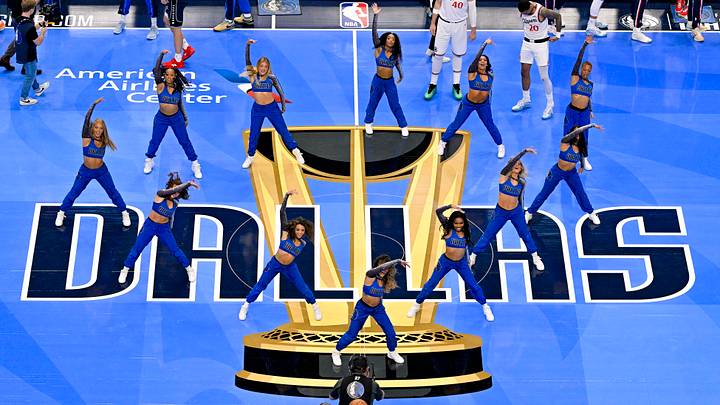
Dallas Mavericks

I think they really nailed this shade of blue. Once the Mavs play their first game it may prove worthy of the King Neptune category, for sure. But it looks really good here despite the black bordering making it stand out more. Cooper Flagg could look like he’s playing on top of an aquarium. I am not confident enough in its final on-screen look to rank it much higher, however.
Indiana Pacers

Pacers yellow is just not a great fit for a basketball court. It’s been a problem throughout Indiana’s NBA Cup runs and does not get solved with this year’s iteration. The deeper blue is a step in the right direction but the yellow baseline just demands your attention in a way not entirely pleasant. Despite that, I bumped this court up from the bottom tier because I love “Boom, Baby!” and the race track accents on the corners.
Los Angeles Clippers

The biggest sin here is that it looks almost identical to the Thunder’s court, so both teams get docked. I otherwise really like the light shade of ocean blue and the cursive is a flair more teams should lean into.
Oklahoma City Thunder

Again, nearly identical to the Clippers’ court. And it’s actually a bit more boring. There’s really nothing going on here except block lettering and two shades of blue.
Philadelphia 76ers

Cursive again! Love that. But the Sixers’ logo is clunky for the Cup court design (those stars are going to stand out in a strange way when players are dribbling past them) and it is basically an inverted version of the Thunder/Clipper courts.
- NEXT: Checking In on the Fascinating 76ers: While LeBron James Looks His Age, There Is a Clear No. 1 Star
Tier 2: Now you have our attention
We can see the vision when it comes to these courts.
Charlotte Hornets

I am mad they did away with the honeycomb design. I thought that was creative and unique in the way the NBA should want its designs to be for the Cup. Despite that, and despite going with the safe gray bordering, the Hornets’ shade of blue remains one of the most attractive base colors for NBA Cup courts around the league.
Detroit Pistons

This is basically just the Pistons’ logo in court form and I am all for it. The red and blue contrast in a really cool way (red can be a great border color if not a good floor color!). The janky font of the mid-court message is a little distracting, though.
MIlwaukee Bucks

The Bucks seem like they found the right shade of green for the floor this time around and I love the cream border. It’s still a little noisy with everything else happening (Fear the Deer?) but it should be a good one to see live and on the broadcast.
New York Knicks

Another court that could go either way. On the one hand, orange for the border is a pretty loud choice that may not compliment that shade of blue very well. On the other, it might be the perfect combo. The Knicks’ orange is just dark enough to be visually pleasing, especially in tandem with the blue. I’m going to predict this looks great rather than garish.
New Orleans Pelicans

The basketball being played in New Orleans might be ugly as sin. This court is not! The gold is awesome and highlights the “Crescent City” lettering really well. The dark blue isn’t anything to call home about but should serve as a nice pairing with the border.
Orlando Magic

The Magic got upgraded from the gray court tier because the blue is outstanding. Very appealing to the eye. And the way the logo’s stars stretch from the trophy is neat. I just really like Orlando’s blue.
Tier 1: Should this be the primary court?
No notes. We can’t wait to see them in action.
Cleveland Cavaliers

My absolute favorite design of the 2026 NBA Cup. The wine red is always a clean look, but balanced with a bronze-gold border? It emphasizes both colors in a perfect way. I could do without the “LET EM KNOW” at mid-court but otherwise I have zero complaints. This is going to be a tremendous view for us to enjoy.
Miami Heat

This is some good stuff right here. The golden floor is a tiny bit at odds with the Cup logos but otherwise makes for a really cool look—particularly when contrasted with the black border and red lettering. It makes for an inspired court design that really captures the spirit of the franchise. Big, big fan.
San Antonio Spurs

Black-on-black is bold. And I like it. This is a neat, subtle design that should make the actual game pop off the screen in a way few courts have accomplished over the years. It’ll make for a cool backdrop for Victor Wembanyama to tower over.
Listen to SI’s NBA podcast, Open Floor, below or on Apple and Spotify. Watch the show on SI’s YouTube channel.
 Add us as a preferred source on Google

Liam McKeone is a senior news writer for the NBA team at Sports Illustrated. He has been in the industry covering the NBA and other sports as a content creator starting in 2017. Prior to joining SI, McKeone worked for NBC Sports Boston and The Big Lead. In addition to his work as a writer, he has hosted the Press Pass Podcast covering sports media and The Big Stream covering pop culture. A graduate of Fordham University, he is always up for a good debate and enjoys loudly arguing about sports, rap music, books and video games. McKeone has been a member of the National Sports Media Association since 2020.
Follow liam_mckeone